 ProMapRanker
Best Google Fonts Alternatives for Kinfolk Serif Font in 2026

Key takeaways
- Playfair Display and Cormorant Garamond come closest to the high-contrast, editorial feel associated with Kinfolk-style typography.
- Libre Baskerville and EB Garamond suit long-form reading, where a softer, book-like serif works better than a display face.
- Lora and Merriweather are the safest all-round picks when one font must handle headings and body text.
- Fraunces and DM Serif Display give a more contemporary editorial voice, with character that stands out at large sizes.
- Every font here is free on Google Fonts, so you can test them in your own layout before committing to one.
Quick comparison
| Pick | Great for | Pricing starts at | Free tier | |
|---|---|---|---|---|
 Playfair Display | Editorial headings | Free | Yes | Visit |
 Cormorant Garamond | Elegant, high-contrast display | Free | Yes | Visit |
 Libre Baskerville | Classic book-style reading | Free | Yes | Visit |
 EB Garamond | Refined long-form text | Free | Yes | Visit |
 Lora | Headings and body in one family | Free | Yes | Visit |
 Merriweather | Screen reading at small sizes | Free | Yes | Visit |
 Crimson Pro | Literary, old-style text | Free | Yes | Visit |
 Fraunces | Contemporary editorial display | Free | Yes | Visit |
 DM Serif Display | Bold modern serif headlines | Free | Yes | Visit |
The best google fonts alternatives for kinfolk serif font
Kinfolk magazine is known for calm, spacious layouts and elegant serif type, and readers often search for a free Google Font with a similar character. No Google Font is an exact copy of a commercial Kinfolk typeface, but the nine faces below share the same family feeling: classical serif forms, generous proportions, and a quiet, editorial tone.
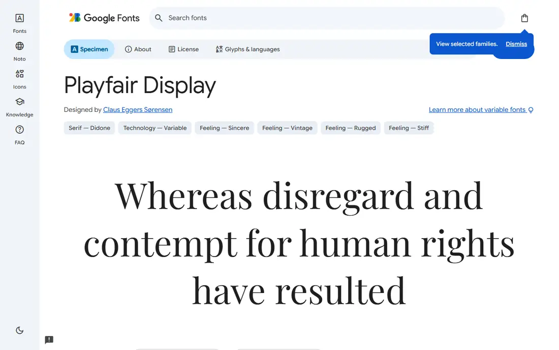
Playfair Display is the first font most designers suggest for a Kinfolk-style look, and for good reason. Its high-contrast strokes and elegant serifs give headlines a magazine feel, especially in large sizes with generous white space. It works well for article titles, cover lines, and section headings where the type itself sets the mood.
The limit is body text. At small sizes, the thin strokes can feel fragile on screen, so pair Playfair Display with a calmer serif or a clean sans for paragraphs. Used that way, it delivers the editorial character readers are looking for without hurting readability.
- High contrast and distinctive letterforms
- Strong at large sizes
- Wide weight range with italics
- Too delicate for small body text
- Can feel formal in casual contexts
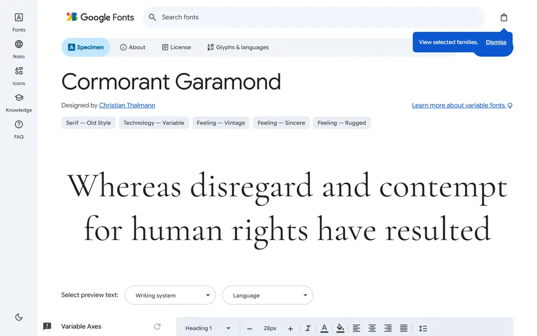
Cormorant Garamond is lighter and more delicate than Playfair Display, with a classical Garamond structure and a graceful italic. It suits lifestyle, food, and travel layouts where the type should feel airy rather than bold. In large headings and pull quotes, it reads as quietly luxurious, which is close to the Kinfolk mood.
That delicacy is also its weakness. Light weights need larger sizes and good contrast to stay readable, especially on mobile screens. Use Cormorant Garamond for display sizes, and choose a sturdier companion for body copy.
- Very refined, light letterforms
- Multiple weights and italics
- Beautiful for fashion and lifestyle layouts
- Light weights can be hard to read at small sizes
- Needs careful sizing on screen
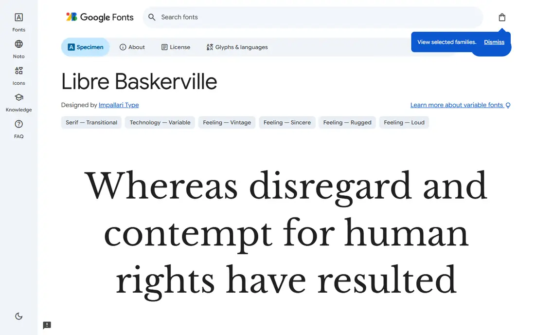
Libre Baskerville brings a bookish, traditional serif to the list, based on the Baskerville style with wider proportions for screen reading. It is a good choice when the Kinfolk-like quality you want is calm, literary text rather than dramatic headlines. Articles, essays, and newsletters set in Libre Baskerville feel measured and easy to read.
It is not a fashion-forward display face, and its weight range is limited, so dramatic headline contrast will need another font. For body text under an editorial heading, though, it is one of the most dependable free serifs available.
- Comfortable for long reading
- Classic Baskerville character
- Reliable across browsers
- Limited weights
- Feels traditional rather than contemporary
EB Garamond is an open-source revival of the classic Garamond style, with a refined, old-style feel that suits long-form writing. It reads well in articles and books, and its italics are genuinely beautiful for quotes and emphasis. If your site is mostly text, EB Garamond gives it a literary, unhurried voice.
At headline sizes, EB Garamond can look a little restrained next to Playfair Display or Fraunces, so it works best as a text face paired with a stronger display serif. That pairing is a classic editorial combination, and it keeps the layout calm.
- Elegant old-style proportions
- Good for long articles
- Wide range of weights and italics
- Can look quiet at headline sizes
- Needs size and spacing to show its character
Lora is our pick for most people who want one font family to do everything. It has brushed curves and a contemporary feel, with enough contrast for headings and enough sturdiness for paragraphs. A blog or small magazine can set the whole site in Lora and still look considered, which is useful when you do not want to manage a font pairing.
The trade-off is distinctiveness. Lora is less immediately recognisable than the high-contrast display faces here, so a site that needs a strong visual signature may still want a display font for titles. For readability plus a gentle editorial tone, it is hard to beat.
- Balanced, contemporary serif
- Works for both headings and body
- Good Cyrillic and Latin coverage
- Less distinctive than Playfair or Cormorant
- Can feel safe rather than striking
Merriweather was designed specifically to be pleasant to read on screens, with a large x-height and sturdy serifs that hold up at small sizes. That makes it a practical choice for a Kinfolk-inspired site that is read mostly on phones, where delicate display faces can fail. Long articles in Merriweather stay comfortable for many paragraphs.
It is not the most elegant face here, and it will not give a layout the same high-fashion feel as Cormorant Garamond. If readability is your priority and you still want a serif voice, Merriweather earns its place, ideally paired with a more expressive heading font.
- Designed for on-screen reading
- Sturdy letterforms
- Large x-height helps small text
- Feels workmanlike rather than elegant
- Less suited to luxury-style display use
Crimson Pro is a variable serif with an old-style, literary character, inspired by classic book typefaces. It suits essays, poetry, and long articles where the text should feel thoughtful and unshowy. As a variable font, it also gives designers fine control over weight, which helps with responsive layouts.
Crimson Pro is quieter than the display faces here, so it will not carry a bold magazine cover on its own. Pair it with a stronger heading font, or use its heavier weights for section titles. For a reading-first site with a literary tone, it is a refined free option.
- Old-style, literary character
- Variable font with many weights
- Good for books and essays
- Quieter personality at display sizes
- Less common, so fewer pairing examples exist
Fraunces is a contemporary variable serif with wonky, characterful letterforms and optical sizing, which means its shapes adjust for small text versus large display use. At headline sizes, it feels modern and editorial, with a warmth that suits lifestyle and food publishing. It is the most distinctive font in this list, and it can give a site a clear identity.
That character needs handling. Fraunces can dominate a layout if used everywhere, so many designers use it for headings and pair it with a neutral text face. If you want a Kinfolk-like calm with a more current twist, Fraunces is the most interesting free choice here.
- Variable font with optical sizes and characterful forms
- Expressive at large sizes
- Modern editorial feel
- Distinctive style can dominate a layout
- Needs care to avoid looking quirky in formal contexts
DM Serif Display is a single-weight display serif built for headlines, with clean, confident letterforms and a modern feel. It pairs especially well with a sans-serif body font, a combination many contemporary editorial sites use. If your layout uses big titles and short intros, DM Serif Display gives it presence without the fragility of a high-contrast light face.
Its single weight is the limit: you cannot vary boldness, so hierarchy must come from size, spacing, and colour. It is also not a body font. For headlines on a calm, editorial site, it is a strong and simple pick.
- Strong, clean display serif
- Works well at large sizes
- Pairs neatly with sans-serif body text
- Single weight, so contrast must come from size
- Not meant for body text
How we picked these
We compared Google Fonts specimen pages, weight ranges, and intended uses for serif typefaces with an editorial character, and we kept only fonts that are free on Google Fonts and genuinely suit a Kinfolk-style layout. We weighed display impact, body-text readability, weight and italic coverage, and how well each face pairs with a companion font. We did not claim to reproduce a commercial Kinfolk typeface exactly; these are similar-character alternatives, not copies.
How to pair and use these fonts
Start with the job of the type, not the font name. Choose a display face for titles, a text face for paragraphs, and stick to two families for most layouts. A reliable pattern is a high-contrast display serif such as Playfair Display or Fraunces for headings, plus a calmer serif such as Lora, EB Garamond, or Merriweather for body text.
Test at real sizes, on a phone as well as a desktop screen. A font that looks elegant at 48 pixels can fail at 16 pixels, especially in a light weight. Check line length too: editorial layouts read best with roughly 60 to 75 characters per line, generous line spacing, and enough white space around headings. Finally, load only the weights and styles you actually use, since each extra weight adds page weight and slows the page.
For a magazine-style homepage
Playfair Display or Fraunces for headlines, with Lora or EB Garamond for article text, gives the closest Kinfolk-like balance of drama and calm.
For a reading-first blog
Lora, Merriweather, or Libre Baskerville as the main text face, with a display serif reserved for titles, will keep long articles comfortable.
For a contemporary editorial brand
Fraunces or DM Serif Display for headlines, paired with a clean sans for body text, gives a modern editorial voice that still feels serif-led.
Frequently asked questions
What font does Kinfolk magazine actually use?
Kinfolk has used different typefaces across its print and digital editions over time, and its exact commercial fonts are not free Google Fonts. The fonts here are similar in character, not identical copies, so treat them as a way to get the same editorial feeling with free type.
Which Google Font is closest to the Kinfolk serif style?
Playfair Display is the closest widely used match for headlines, thanks to its high contrast and editorial feel. Cormorant Garamond is a close second if you want a lighter, more delicate display face.
Can I use these fonts for free on a commercial website?
Yes, all nine fonts are available free through Google Fonts, including for commercial use, under their open licences. Check the licence on each font's Google Fonts page before use, since terms can differ by project.
Which font is best for body text, not just headings?
Lora and Merriweather are the safest body-text picks here, with EB Garamond and Libre Baskerville close behind for long-form reading. Avoid using high-contrast display faces at small sizes, where their thin strokes lose readability.
How many fonts should I use on one site?
Two families are enough for most sites: one for headings and one for body text. A third font for captions or labels can work, but each extra family adds loading time and visual noise.
Do these fonts work well on mobile?
Yes, with the right sizes. Merriweather and Lora hold up best at small sizes, while light display faces such as Cormorant Garamond need larger sizes and strong contrast on phones. Always test on a real phone before launch.
Sources
- https://fonts.google.com/specimen/Playfair+Display
- https://fonts.google.com/specimen/Cormorant+Garamond
- https://fonts.google.com/specimen/Libre+Baskerville
- https://fonts.google.com/specimen/EB+Garamond
- https://fonts.google.com/specimen/Lora
- https://fonts.google.com/specimen/Merriweather
- https://fonts.google.com/specimen/Crimson+Pro
- https://fonts.google.com/specimen/Fraunces
- https://fonts.google.com/specimen/DM+Serif+Display
See where you really rank - block by block
ProMapRanker scans Google Maps across a grid of your service area. Simple monthly plans from $19, white-label on every plan.
Start freeKeep reading
 best resource management software
Best Resource Management Software in 2026
We compared the best resource management software for scheduling, capacity and utilization, with current pricing and free trials, to help teams choose well.
Read → best reporting tools
Best Reporting Tools in 2026
Compare the best reporting tools for dashboards, scheduled reports, and business insights, from Power BI and Tableau to Looker Studio for every team size.
Read → best remote support software
Best Remote Support Software in 2026
Looking for the best remote support software? We compare 9 tools on price, security, session controls, and fit for helpdesks, MSPs, and small teams in 2026.
Read →