 ProMapRanker
Best Alternatives to Flexbox in 2026

Key takeaways
- CSS Grid is our pick for page layouts, dashboards, and galleries, because it controls rows and columns at the same time.
- Tailwind CSS suits teams that want utility classes for both Grid and Flexbox without writing custom CSS files.
- Bootstrap suits teams that want a ready-made grid, components, and documentation in one package.
- Component libraries such as Chakra UI and Mantine suit React teams that want layout plus accessible components.
- Most projects still use more than one approach: Grid for the page skeleton, and a framework or component library inside it.
Quick comparison
| Pick | Great for | Pricing starts at | Free tier | |
|---|---|---|---|---|
 CSS Grid | Two-dimensional page layouts | Free | Yes | Visit |
 Tailwind CSS | Utility-first layouts | Free | Yes | Visit |
 Bootstrap | Ready-made grid and components | Free | Yes | Visit |
 Bulma | Simple CSS-only framework | Free | Yes | Visit |
 Foundation | Responsive business sites | Free | Yes | Visit |
 UIkit | Lightweight component framework | Free | Yes | Visit |
 Chakra UI | React layout and components | Free | Yes | Visit |
 Mantine | React layout and hooks | Free | Yes | Visit |
The best alternatives to flexbox
Flexbox is a one-dimensional layout tool: it arranges items along a row or a column and distributes space along that axis. That makes it excellent for navbars, button groups, and card content, but it is not always the best tool for a full page, a dashboard, or a gallery. The options below give you two-dimensional control, ready-made grids, or component-based layout, and none of them require you to use Flexbox as the main layout system.
CSS Grid is native CSS for two-dimensional layouts, and it is the most direct alternative when Flexbox feels like a stretch. You define columns and rows, place items into cells, span items across tracks, and name areas for a page skeleton such as header, sidebar, main, and footer. Subgrid, now supported in current browsers, lets a nested grid share track sizes with its parent, which solves a long-standing alignment problem for cards and forms.
Grid needs no library, no build step, and no extra download, which keeps pages light. The catch is the learning curve for advanced features such as implicit tracks, auto-placement, and subgrid, although basic layouts are quick to learn. Very old browsers need a fallback, but current browsers support Grid well. For page structure, dashboards, and galleries, Grid is the tool we would learn first.
- Rows and columns together
- Subgrid support
- No build step
- Learning curve for advanced features
- Needs fallbacks for very old browsers
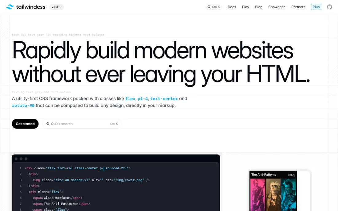
Tailwind CSS is a utility-first framework that lets you build layouts with classes in your markup, including grid, flex, spacing, and responsive prefixes. A card grid can be written as a set of classes that change column counts at each breakpoint, without opening a separate stylesheet. That speed suits prototyping and teams that want layout decisions visible in the component file.
Tailwind is free and open source, and its build step removes unused classes, so production CSS stays small when configured well. The trade-off is markup: pages carry many classes, which some developers find noisy, and learning the utility names takes time. Tailwind can use Flexbox utilities, but you can also build a layout entirely with its Grid utilities, which is why it belongs here as an alternative system rather than a Flexbox wrapper. For fast, consistent layouts, it is a strong pick.
- Grid and flex utilities
- Responsive prefixes
- Small production builds
- Class-heavy markup
- Learning curve for the utility set
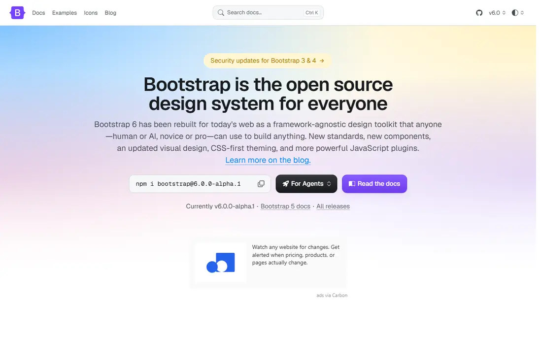
Bootstrap is a front-end framework with a 12-column grid, responsive breakpoints, and a large set of components for navbars, cards, forms, and modals. Its grid uses Flexbox under the hood in current versions, but as a system it gives you a ready-made layout language: rows, columns, gutters, and breakpoints, without designing a grid from scratch. That completeness is why it remains popular for admin panels, internal tools, and business sites.
Bootstrap is free and open source, and its documentation is extensive, with examples for almost every component. The catch is weight and sameness: a default Bootstrap site can look generic, and the full CSS is heavier than a hand-written Grid layout, although you can import only the grid and utilities you need. For teams that want layout plus components in one documented package, Bootstrap is still a practical choice.
- 12-column grid
- Many components
- Strong documentation
- Heavier than native Grid
- Sites can look similar
Bulma is a CSS framework based on Flexbox for its columns, but as a layout system it offers a simple column grid, tiles for two-dimensional arrangements, and clean component defaults, all without requiring JavaScript. Its class names are readable, and the documentation shows layout examples that are easy to copy. A small team that wants a tidy site without a build step or a JavaScript framework often finds Bulma a good fit.
Bulma is free and open source. The trade-off is scope: it has fewer components and fewer third-party themes than Bootstrap, and its tile system is not as powerful as native CSS Grid for complex dashboards. For simple marketing pages, blogs, and internal tools, though, Bulma gives you a coherent layout system with little setup. It is a calm, readable alternative when Bootstrap feels too large.
- CSS only, no JavaScript needed
- Readable class names
- Clean defaults
- Fewer components than Bootstrap
- Smaller ecosystem
Foundation is a responsive front-end framework with a grid system, breakpoints, and components for business and marketing sites. It has long emphasised accessibility and responsive design, and its XY grid gives you control over horizontal and vertical alignment in a structured way. Teams that build corporate sites, email templates, or multi-page business sites have used Foundation for years for that reason.
Foundation is free and open source. Its community is smaller than it was at its peak, so fresh themes and tutorials are fewer than for Bootstrap or Tailwind, and new teams should check that the version they pick is still maintained for their use case. The grid itself remains a solid, documented system for responsive layouts. For a business site where a structured grid and accessible components matter, Foundation is still worth a look.
- Responsive grid
- Business-focused components
- Accessibility focus
- Smaller community than before
- Fewer fresh themes
UIkit is a lightweight front-end framework with a grid system, flex utilities, and a set of components for navbars, cards, and off-canvas menus. Its grid is straightforward to use, with width classes and breakpoints that cover most responsive layouts, and its components are clean without heavy styling. A team that wants a small framework for a marketing site or a web app front end can adopt UIkit quickly.
UIkit is free and open source, and it works with plain HTML, CSS, and JavaScript. The catch is ecosystem size: fewer themes, fewer integrations, and fewer community examples than Bootstrap or Tailwind. That matters less for a self-contained site and more for a large app that needs many ready-made pieces. For a light, tidy layout system with components included, UIkit is a good middle ground.
- Lightweight
- Grid and flex utilities
- Clean components
- Smaller ecosystem
- Fewer React integrations
Chakra UI is a React component library with layout primitives such as Box, Flex, Grid, Stack, and SimpleGrid, plus accessible components for forms, modals, and navigation. Its Grid and SimpleGrid components let a React team build two-dimensional layouts with props for columns, gaps, and breakpoints, without writing separate CSS files. Theming is built in, so spacing, colours, and breakpoints stay consistent across a project.
Chakra UI is free and open source. The main limit is that it is React only, so it does not help a plain HTML, Vue, or Angular project. Bundle size also grows as you use more components, although tree-shaking helps. For a React team that wants layout and accessible components in one system, Chakra UI removes a lot of custom CSS work and keeps layout decisions in the component code where the team already works.
- Accessible components
- Layout primitives
- Theming
- React only
- Bundle size grows with use
Mantine is a React component library with a Grid system, layout components, and a large set of hooks for common interface tasks. Its Grid component supports columns, gutters, and responsive breakpoints, and its AppShell component gives you a page skeleton with header, navbar, and main areas in a structured way. That combination suits dashboards and internal tools, where layout consistency matters across many screens.
Mantine is free and open source, and its documentation is detailed, with examples for layout, forms, and data display. The trade-off is scope: the API surface is large, and learning the full library takes time, although you can adopt only the layout parts at first. Like Chakra UI, it is React only. For a React dashboard or admin tool, Mantine gives you layout plus a deep component set in one place.
- Grid and layout components
- Many hooks
- Strong documentation
- React only
- API surface is large
How we picked these
We compared official documentation for layout systems that are active in October 2026 and that can build a page without Flexbox as the main layout tool. We favoured native CSS Grid for two-dimensional control, plus frameworks and component libraries with a documented grid or layout system, readable class or prop names, and current maintenance. We did not claim hands-on testing of private projects, and we listed these tools as free because their core code is open source.
What to check before you choose a layout system
Ask what kind of layout you build most often. A page skeleton with header, sidebar, and main areas points to CSS Grid. A set of marketing pages with many similar sections points to Tailwind or Bootstrap. A React dashboard points to Chakra UI or Mantine. A simple site with little JavaScript points to Bulma or UIkit. The wrong choice usually shows up as extra wrapper elements and breakpoint hacks, not as a single missing feature.
Check browser support and build setup together. Native Grid needs no build step, while Tailwind needs a build step to keep CSS small, and component libraries need a React setup. Check how the system handles responsive breakpoints, gaps, and alignment, because those three details decide how much custom CSS you still write. Finally, prototype one real page, not a demo card grid, before you commit a whole project to a new system.
Frequently asked questions
What is the best alternative to Flexbox for page layouts?
CSS Grid is the best alternative for page layouts, because it controls rows and columns at the same time, while Flexbox controls one axis at a time. Use Grid for the page skeleton, dashboards, and galleries, and keep Flexbox for small pieces inside a grid cell, such as a navbar or a button group. Most real projects use both, each for the job it fits.
Is CSS Grid better than Flexbox?
Neither is better in general; they solve different problems. Grid is layout-first, with tracks defined in advance, while Flexbox is content-first, with items sizing themselves along one axis. A page that needs precise two-dimensional control favours Grid, while a row of items that should wrap and distribute space favours Flexbox. Learning both gives you more options than choosing one.
Can I use Bootstrap without Flexbox?
Bootstrap grid uses Flexbox under the hood in current versions, but as a developer you work with its row and column classes, not with raw flex properties. If your goal is to avoid writing Flexbox code yourself, Bootstrap qualifies. If your goal is to avoid Flexbox entirely in the rendered CSS, native CSS Grid is the cleaner choice.
Is Tailwind CSS a Flexbox alternative?
Tailwind provides both Grid and Flexbox utilities, so you can build layouts with Grid classes and avoid Flexbox classes if you prefer. That makes it a layout system alternative, not a single-property replacement. Its strength is speed and consistency through utility classes, with responsive prefixes for breakpoints.
Which layout tool is easiest for beginners?
Native CSS Grid is easy to learn for basic page layouts, because a few properties define columns, rows, and gaps. Bulma and Bootstrap are also beginner-friendly, because they give you ready-made classes and examples. The easiest choice depends on whether you prefer writing CSS or using classes in markup, so try a small page in each before you decide.
Sources
See where you really rank - block by block
ProMapRanker scans Google Maps across a grid of your service area. Simple monthly plans from $19, white-label on every plan.
Start freeKeep reading
 best chat tool for website
Best Chat Tool for Website in 2026
Best chat tool for website owners compared, with live chat, AI agents, free plans, and pricing for small stores, SaaS teams, and support teams of all sizes.
Read → best birdwatching app
Best Birdwatching App in 2026
Best birdwatching app picks for 2026: nine free and paid apps for bird ID by sight and sound, checklists, hotspots, and finding birds near you for all birders.
Read → best bird identification app
Best Bird Identification Apps in 2026
Find the best bird identification app for photos, songs and calls. We compare 9 bird apps, including Merlin, BirdNET and Audubon, to help you choose today.
Read →