 ProMapRanker
Best Shadcn Alternatives in 2026


Accessible apps with a style-props workflow · Pricing starts at: Free
Key takeaways
- Most shadcn alternatives here are free and open source, so the real cost is learning time and maintenance, not a license fee.
- Mantine and MUI suit teams that want many ready-made components on day one, while Headless UI and Radix-style primitives suit teams building a custom design system.
- Chakra UI, HeroUI, and DaisyUI keep a Tailwind-friendly workflow, which makes them natural moves for teams already using Tailwind CSS.
- If you need data grids, charts, and complex forms, MUI and Ant Design give you the deepest component sets in this list.
- Check component coverage for your exact screens before you commit, because a library that looks complete can still lack a date picker, chart, or table you need.
Quick comparison
| Pick | Great for | Pricing starts at | Free tier | |
|---|---|---|---|---|
| Chakra UI | Accessible apps with a style-props workflow | Free | Yes | Visit |
 Mantine | Dashboards that need many components fast | Free | Yes | Visit |
 MUI | Enterprise apps with complex data displays | Free | Yes | Visit |
 Ant Design | Data-heavy admin and internal tools | Free | Yes | Visit |
 HeroUI | Polished consumer-facing React apps | Free | Yes | Visit |
 DaisyUI | Fast Tailwind prototyping | Free | Yes | Visit |
 PrimeReact | Feature-rich business applications | Free | Yes | Visit |
 Headless UI | Fully custom designs on accessible primitives | Free | Yes | Visit |
 Tamagui | Shared code across web and native apps | Free | Yes | Visit |
The best shadcn alternatives
shadcn/ui is a collection of reusable components that you copy into your own project and own outright. That model appeals to teams that want control, but it also means you assemble and maintain more yourself. The libraries below take different approaches, from complete component sets to unstyled primitives, and each one fits a different kind of team.
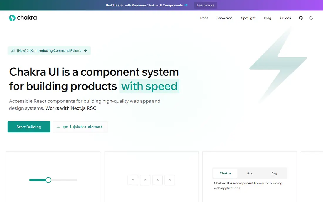
Chakra UI gives you a full set of styled components with accessibility built in from the start. Keyboard behavior, focus handling, and ARIA attributes are handled by the components, which saves time on apps that must work well for every user. The style-props API lets developers set spacing, color, and layout directly on components without writing separate style files. That approach feels fast when you are building screens quickly, and it stays readable for new team members.
The trade is bundle size and styling philosophy. Chakra UI carries more code than a primitives-only library, and teams committed to Tailwind CSS may find its approach a second system to learn. Theming is flexible, though, and you can shape the default look into something distinct with tokens for color, spacing, and type. For product teams that value accessibility and speed over owning every line of component code, Chakra UI is a steady pick.
- Strong accessibility defaults
- Simple style-props API
- Good theming support
- Larger bundle than lighter options
- Not Tailwind-first by design
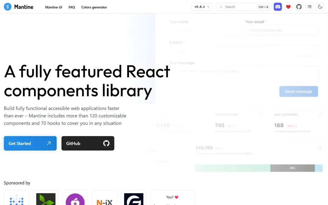
Mantine is one of the most complete free React libraries available. It ships more than 100 components plus a large hooks collection covering forms, dates, notifications, modals, and charts. That breadth matters for dashboards and admin tools, where the work is often wiring up tables, filters, and forms rather than inventing new visual ideas. Documentation is direct and includes working examples, which helps junior developers get productive quickly.
The honest catch is visual identity. Out of the box, Mantine looks functional rather than distinctive, so consumer-facing products will need theming and custom styling to stand apart. Its styling system is its own, so Tailwind-first teams should expect a learning step. If your priority is shipping a working internal tool or SaaS dashboard on a tight schedule, Mantine gives you more ready parts than almost any other free option here.
- Very large component and hooks library
- Clear documentation
- Free for commercial use
- Default look can feel plain
- Design character needs extra theming work
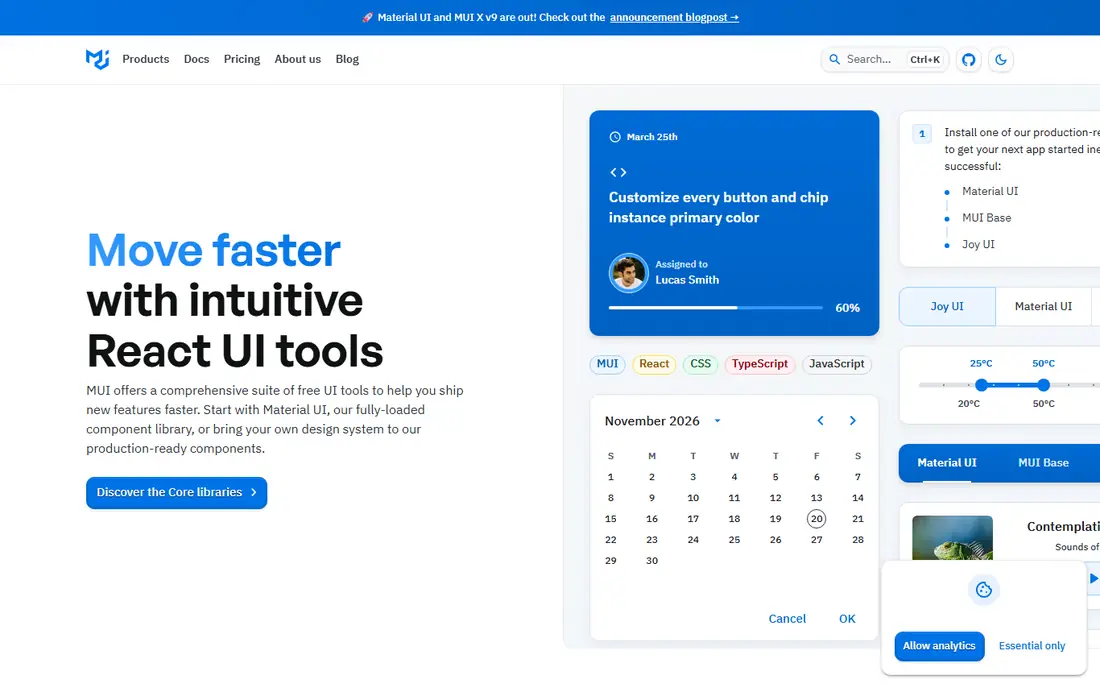
MUI, formerly Material UI, remains the most established React component library for large applications. The free core covers buttons, inputs, dialogs, navigation, and layout, while the paid MUI X line adds advanced data grids, date pickers, and charts for teams that need them. That split is worth noting early: the free tier is generous, but the most powerful data tools sit behind a per-developer license. For enterprise dashboards with dense tables and filtering, that paid tier can still be good value.
The default Material Design styling is recognizable, and teams that want a fully custom brand will spend time overriding it. On the other hand, MUI's maturity shows in its documentation, TypeScript support, and the number of examples available for common enterprise patterns. If your app is data-heavy and your team wants a library with a long track record, MUI is hard to beat.
- Huge component set including data grids
- Mature ecosystem
- Strong documentation
- Material Design look needs work to hide
- Advanced data grid features are paid
Ant Design is a design system and component library built for enterprise applications, and its table, form, and data-entry components are among the strongest available for free. It handles complex filtering, sorting, pagination, and validation patterns that smaller libraries leave to you. Teams building admin panels, back-office tools, and internal systems will find that many of their hardest screens are already covered. Internationalisation support is also solid, which matters for products used across regions.
The default look is unmistakable, and reshaping it into a unique brand takes deliberate theming work. Ant Design is also a large dependency, so it fits full applications better than small marketing sites. For data-heavy internal tools, though, its completeness outweighs those costs, and its long history means edge cases have usually been solved by someone before you.
- Extremely broad component set
- Strong table and form components
- Widely used in enterprise
- Distinctive default style
- Larger bundle and learning curve
HeroUI, formerly NextUI, is a Tailwind-native component library built on React Aria primitives. That combination gives you components that look polished from the start while keeping accessibility behavior from a well-tested foundation. Theming uses Tailwind utilities and design tokens, so teams already working with Tailwind can adapt HeroUI without adopting a second styling language. It is a natural fit for consumer-facing apps where first impressions matter.
The component set is smaller than Mantine, MUI, or Ant Design, so teams building complex admin tools should check coverage for tables, charts, and advanced forms before committing. Community size is also smaller than the oldest libraries, though it has grown steadily. For marketing sites, dashboards with a consumer feel, and new SaaS products, HeroUI offers a strong balance of looks, accessibility, and speed.
- Attractive defaults built on React Aria
- Tailwind-friendly theming
- Good accessibility
- Smaller component set than MUI or Ant Design
- Newer ecosystem than older libraries
DaisyUI is not a JavaScript component library in the usual sense. It is a plugin for Tailwind CSS that adds component class names, themes, and semantic color names on top of Tailwind utilities. That makes it extremely fast for prototyping: add the plugin, use class names for buttons, cards, and menus, and switch themes with a single attribute. Teams that already know Tailwind can build a decent-looking interface in hours rather than days.
The limit is interactivity. DaisyUI provides styles, not the JavaScript behavior behind complex widgets such as date pickers, comboboxes, or data tables, so you will pair it with other code for those pieces. It also ties you closely to Tailwind, which is a benefit if that is your stack and a drawback if it is not. For prototypes, landing pages, and simple apps, DaisyUI is one of the quickest routes to a finished look.
- Very fast to start with Tailwind
- Theme switching built in
- No JavaScript required for many components
- Component behavior is class-based
- Less suited to complex interactive widgets
PrimeReact is part of the Prime family of component libraries, and it ships one of the largest catalogs in this list, covering data tables, trees, charts, editors, and scheduling components. Its data table in particular handles sorting, filtering, grouping, and lazy loading, which makes it a practical choice for business applications that live in tables all day. Several themes are included, and a visual theme designer is available for teams that want to adjust colors without hand-editing CSS.
The trade is polish. Some default themes feel more corporate than modern, and documentation depth is uneven across the catalog, so expect to read source examples for less common components. PrimeReact also has its own styling approach, so Tailwind-first teams will be running two systems side by side. If component breadth matters more than a fashion-forward default look, PrimeReact deserves a close look.
- Very large component catalog
- Strong data table
- Multiple themes included
- Default themes can look dated
- Documentation quality varies by component
Headless UI takes the opposite approach from MUI or Ant Design. It provides unstyled, accessible components for menus, dialogs, listboxes, and switches, and leaves all visual design to you. That is exactly what design-system teams want: keyboard navigation, focus management, and ARIA behavior are handled, while colors, spacing, and typography come from your own Tailwind classes or CSS. The result can look like anything, because the library imposes almost nothing.
The cost is effort. Every component needs styling, and you will write more code than with a styled library. Headless UI also covers fewer component types, so tables, charts, and calendars are your responsibility. For teams with a distinct brand, an existing design system, or a designer who wants full control, that trade is worth it. For teams that want screens quickly, a styled library will be faster.
- Accessible behavior without imposed styling
- Works with Tailwind
- Small and focused
- You build all visual design yourself
- Fewer components than full libraries
Tamagui is a UI system designed for teams building for both web and native mobile from one codebase. Components, themes, and styles can be shared across React DOM and React Native, which can save real duplication for products that need both a web app and a mobile app. Its compiler optimizes styles at build time, which helps performance, and its theme system supports light and dark modes plus custom tokens.
The learning curve is steeper than a standard web library, because you are learning Tamagui's styling model as well as its component API. The community is smaller than MUI or Chakra UI, so answers to unusual problems may take longer to find. For web-only projects, that added complexity is usually unnecessary. For teams committed to shared web and native code, Tamagui is one of the few options built for that job from the start.
- One codebase for web and React Native
- Optimizing compiler
- Theme system included
- Steeper learning curve
- Smaller community than web-only libraries
How we picked these
We compared official documentation, component catalogs, pricing pages, and accessibility notes for each library, and we favored libraries that are actively maintained and work with current React and Tailwind setups. We looked for a mix of complete styled libraries, Tailwind-friendly options, and unstyled primitives, so that different team sizes and design needs are covered. We did not claim hands-on testing of every library in a production app; our comparisons rest on published features, pricing, and public documentation. Prices here reflect free open-source licenses for the core libraries, with paid tiers noted where they apply to advanced components.
What to check before you choose
Start with your component list, not with a library's marketing page. Write down the screens your app actually needs, including tables, forms, date pickers, charts, and dialogs, then check each candidate against that list. A library that covers 90 percent of your screens but lacks a usable data table can cost more in custom work than a slightly less attractive library that covers everything.
Next, match the styling model to your team. Tailwind teams will move fastest with HeroUI, DaisyUI, or Headless UI, while teams without a strong styling preference may prefer the ready-made look of Mantine, MUI, or Ant Design. Consider accessibility requirements early as well, since fixing keyboard and screen-reader behavior after launch is far more expensive than choosing accessible components at the start.
Finally, think about maintenance. A library you own and customize, like the shadcn/ui model, gives you control but also gives you update work. A packaged library gives you updates from its maintainers but can change its API under you. Check release activity, TypeScript support, and how the library handles major version upgrades before you commit a large codebase to it.
Frequently asked questions
What are the best alternatives to shadcn?
The best alternatives to shadcn depend on what you miss about it. Mantine and MUI are strong if you want more ready-made components, HeroUI and DaisyUI suit Tailwind teams, and Headless UI fits teams that want full design control on accessible primitives. Start from your component list and styling stack, then narrow to two candidates and build one real screen with each.
Is shadcn/ui itself free?
Yes, shadcn/ui components are free and open source, and you copy the code into your own project. The cost is your time spent assembling, styling, and maintaining those components. The alternatives in this list are also largely free for their core libraries, with paid tiers mainly for advanced data components or premium themes.
Which shadcn alternative is best for dashboards?
Mantine, MUI, and Ant Design are the strongest dashboard picks here, because they include tables, forms, charts, and layout components in one package. Mantine is the fastest free start, MUI adds a mature paid data grid, and Ant Design excels at complex enterprise forms. Check table and filtering behavior against your actual data before you decide.
Do these libraries work with Next.js?
Most of the libraries here work with Next.js and current React versions, though setup steps differ for server components and styling. Check each library's installation guide for Next.js notes, especially around CSS imports and client components. Headless UI and HeroUI are commonly used with Next.js and Tailwind, and MUI and Mantine publish their own Next.js setup guidance.
Should I choose a styled library or unstyled primitives?
Choose a styled library if you need to ship screens quickly and a good default look is acceptable. Choose unstyled primitives such as Headless UI if your brand is distinctive, you have a design system, or you want full control over every pixel. Many teams mix the two, using a styled library for admin screens and primitives for customer-facing pages.
Is Tamagui only useful for mobile apps?
No, Tamagui works for web apps too, but its main advantage appears when you also ship React Native apps from the same codebase. For a web-only project, a web-focused library will usually be simpler to learn and maintain. Consider Tamagui when shared web and native code is a real product requirement, not just a future possibility.
Sources
See where you really rank - block by block
ProMapRanker scans Google Maps across a grid of your service area. Simple monthly plans from $19, white-label on every plan.
Start freeKeep reading
 zscaler alternatives
Best Zscaler Alternatives in 2026
Looking for zscaler alternatives? We compare 9 SASE and zero trust platforms on architecture, data protection, pricing, and fit for your network and team.
Read → zapier alternatives free
Best Zapier Alternatives Free in 2026
Nine automation tools for zapier alternatives free in 2026, all with genuinely free tiers, plus free plan limits, starting prices and upgrade paths explained.
Read → which platform is best for online reputation
Which Platform Is Best for Online Reputation in 2026
Wondering which platform is best for online reputation? We compare 8 review, listing, and response tools for small and multi-location businesses and agencies.
Read →