 ProMapRanker
Best UX UI Banking App Fintech Examples in 2026

Key takeaways
- Monzo and Chime show that a calm home screen with balance and recent spending first beats a crowded dashboard.
- Revolut and Wise show how to hide complexity, with extra products and currencies kept one or two taps away from daily banking.
- Starling and SoFi show two different routes to depth, with custom spaces on one side and modular blocks on the other.
- Availability varies by country, so check whether an app serves US residents before judging it as a daily bank.
Quick comparison
| Pick | Great for | Pricing starts at | Free tier | |
|---|---|---|---|---|
 Revolut | Multi-currency banking in one app | Free | Yes | Visit |
 Monzo | Spending clarity and pots | Free | Yes | Visit |
 Chime | Simple everyday US banking | Free | Yes | Visit |
 Starling Bank | Custom spaces and business tools | Free | Yes | Visit |
 Nubank | Simple credit and banking in Latin America | Free | Yes | Visit |
 N26 | Clean eurozone mobile banking | Free | Yes | Visit |
 Wise | Clear global transfers and balances | Free | Yes | Visit |
 SoFi | All-in-one money dashboard | Free | Yes | Visit |
 Ally Bank | Online banking with human support | Free | Yes | Visit |
 Cash App | Fast peer payments and spending | Free | Yes | Visit |
The best ux ui banking app fintech examples
We compared official product pages, app store listings, and public design reviews for banking and fintech apps praised for interface and experience. This is not financial advice, and account terms, fees, and availability change by country, so check the vendor page before opening an account.
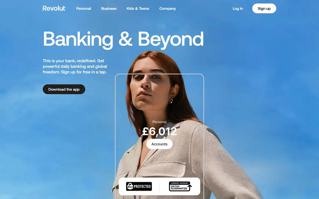
Revolut teaches progressive disclosure, which means the home screen shows only what a basic user needs, such as pay, transfer, and top-up. Crypto, stocks, insurance, and other products sit two taps away, so a new user is not forced to learn a super-app on day one. That restraint is the design lesson, since the product surface is huge yet the first screen stays calm.
The trade-off is that depth still has to live somewhere. Paid tiers, fair-usage limits, and weekend currency rules add fine print that a casual user may miss. Travelers and people who hold several currencies get the most from Revolut, while a user who wants one plain checking account may find the extra layers distracting.
- Simple actions on the home screen with deeper products tucked away
- Instant transaction updates
- Wide currency and travel features
- Paid tiers can feel complex
- Support quality draws mixed public reviews
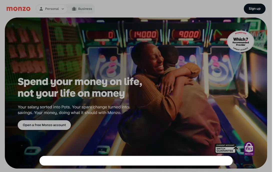
Monzo teaches consistency. The layout stays in the same place between sessions, so the transfer button and the balance are where muscle memory expects them. Transactions appear at once with clear categories, and monthly summaries turn raw spending into plain language without scolding the user. That steadiness builds trust in a way a flashy redesign cannot.
The limit is geography and tone. Monzo is strongest in the UK, and US availability has grown slowly, so US readers should treat it as a design example first and a daily bank second. The bright coral branding and friendly copy also divide opinion, since some people want a bank that feels formal. For clarity of spending, though, few apps match it.
- Stable layout that rarely rearranges
- Real-time categorised spending
- Pots and salary tools that are easy to grasp
- Mainly a UK product with slow US expansion
- Playful style may feel too casual for some
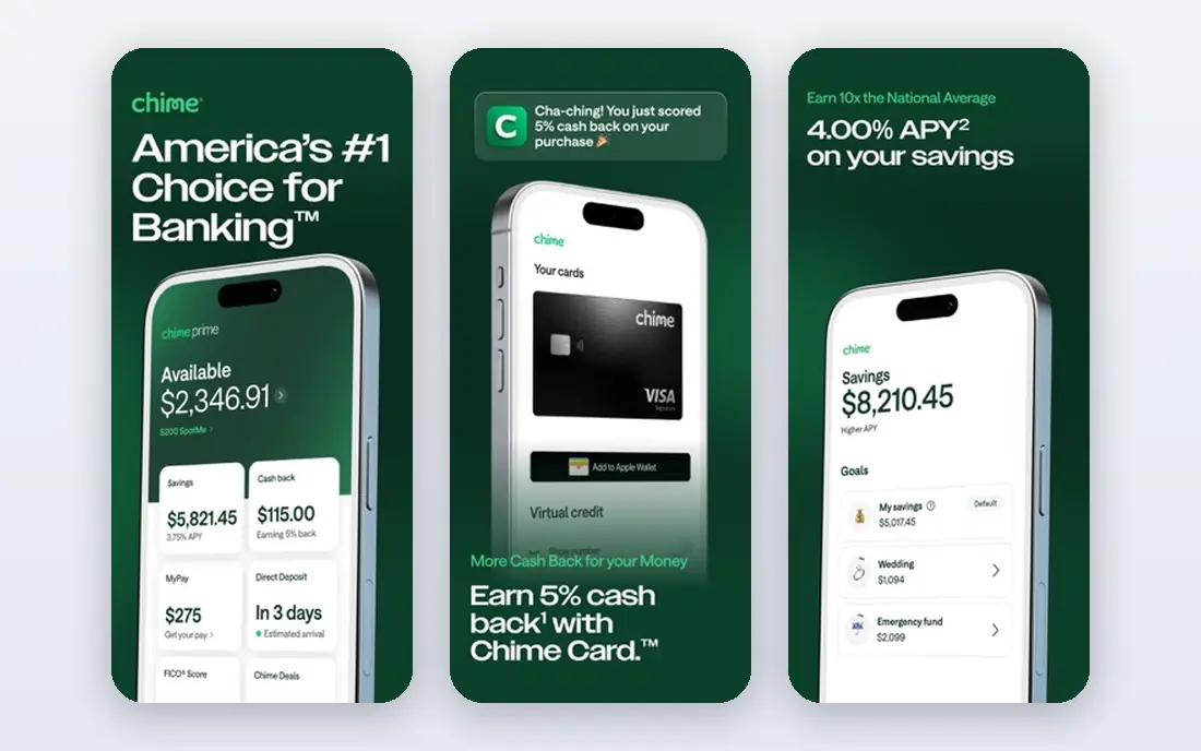
Chime teaches onboarding as a conversation. Account creation takes minutes in the app, with no branch visit and no mailed paperwork, and the home screen leads with balance and recent activity rather than promotions. Early access to direct deposit and a fee-free overdraft feature called SpotMe give the design a clear purpose, which is to reduce stress around paydays and small shortfalls.
The catch is depth. Chime is a fintech, not a bank itself, and banking services come through partner banks, which matters for how support and edge cases work. Power users who want branches, complex lending, or deep investment tools will need a second provider. For a first or everyday US account, the simplicity is the point.
- Fast, conversational onboarding
- Calm balance-first home screen
- Early direct deposit and fee-free overdraft features
- Fewer deep features than full-service banks
- Deposits sit at partner banks
Starling teaches depth without clutter. Spaces let users split money for goals, bills, or trips, while insights and card controls stay easy to reach. The design balances accessibility and clarity with tools that freelancers and small firms actually use, such as business spaces and spending views. It feels like a bank that expects users to shape it to their own habits.
The limits are familiar for UK digital banks. US readers should study Starling as an example rather than assume they can open an account, and the range of custom options can take a few days to learn. Once set up, though, the app rewards the effort, since daily banking stays simple while goals and business money stay separate.
- Customisable spaces for saving goals
- Clear insights and straightforward navigation
- Strong business account tools
- Mainly a UK product
- Some users face a short learning curve with customisation
Nubank teaches transparency in a market where fees were often hidden. Credit card statements show interest projections, loan offers show total cost over the full term, and bills use colour and plain language instead of jargon. Onboarding lets users explore products before completing full identity checks, which reverses the usual verify-first pattern and lowers the barrier for new customers.
The trade-off is reach. Nubank serves mainly Latin America, so US readers should treat it as a design study in clear credit communication rather than a local option. It also offers less for people who need many currencies or global transfers. For simple, honest credit design, it remains a strong example.
- Minimal, warm interface with colour-coded bills
- Clear upfront costs for credit
- Progressive onboarding that explains products before full verification
- Largely limited to Brazil, Mexico, and Colombia
- Fewer multi-currency tools than global rivals
N26 teaches single-level simplicity. The home screen answers the two questions that matter, which are how much money you have and what just happened, and every other action lives exactly one level down. Real-time notifications after each transaction keep the balance honest, and Spaces help with budgeting without adding a second app.
The limit is availability. N26 does not serve US residents, and standard accounts focus on euros, so dollar or sterling needs call for a second provider. Support has also drawn mixed public comment. As a lesson in restraint, though, N26 is hard to beat, since it proves a banking app does not need three ways to start the same task.
- Balance and last transaction front and centre
- One level down to every other action
- Free standard account with virtual card
- Not available to US or UK residents
- Euro accounts only in the standard setup
Wise teaches cost clarity. Before a transfer is sent, the screen shows the rate, the fee, and the exact amount the recipient gets, updating as the amount is typed. That removes the usual surprise of discovering an exchange rate only after money has moved. Holding balances and local bank details in several currencies makes the app practical for freelancers and people with family abroad.
The catch is that Wise is not a traditional bank everywhere, and funds are safeguarded rather than covered in the same way in each market. Cash deposits are not a strength, and ATM terms have changed over time, so check current limits. For global money, the interface sets a standard other apps still chase.
- Exact fee and recipient amount shown before sending
- Mid-market rate framing with live cost previews
- Local details in several currencies
- Not a full bank in every market
- Cash deposits are limited and ATM allowances apply
SoFi teaches modular banking. The dashboard is built from blocks for checking, savings, investing, and loans, so a user can see a whole money picture without opening four apps. Advice cards and goal tools aim to nudge good habits, and the lack of a monthly fee on checking and savings keeps the entry point simple for US users.
The trade-off is noise. Users who want a quiet bank may find the coaching and cross-selling cards pushy, and investment products carry risk that no dashboard design removes. SoFi fits people who want banking, investing, and borrowing in one place and who like guidance. People who want a plain account should turn off what they do not use.
- Modular dashboard blocks for banking, investing, and loans
- Advice cards and goals in one view
- No monthly fee on checking and savings
- Coaching cards can feel heavy for users who want quiet banking
- Investing carries risk and needs separate care
Ally Bank teaches accessibility as a design choice, not an afterthought. High contrast, clear labels, and tooltips help users who find newer fintech apps too dense or too playful, and the experience stays consistent across phone and desktop. No monthly fee and no minimum deposit on the spending account keep the offer plain, while savings tools sit alongside checking without a hard sell.
The limit is style and branches. Younger users may find the look dated next to Monzo or Cash App, and there are no branches for deposits or face-to-face help. For a US user who wants a calm, online-first bank with real support behind it, Ally remains a steady example of thoughtful, inclusive design.
- Accessible, high-contrast design with helpful tooltips
- No monthly fee or minimum on spending accounts
- Round-the-clock support by phone and chat
- Visual style feels older than newer fintech apps
- No branches for cash or in-person help
Cash App teaches speed. Sending money to a friend takes two taps, the interface uses large type and strong contrast, and transaction feedback arrives at once. Custom cards and a simple balance view keep the product feeling personal rather than institutional, which is why it resonates with younger users and peer payment groups.
The catch is scope. Cash App works well for payments and everyday spending, but it is not a full replacement for a traditional bank for every need, and its bold tone can feel out of place for formal money matters. As a UX example, it proves that removing steps matters more than adding features, provided the core task stays clear.
- Two-tap peer payments
- Bold, fast interface that suits younger users
- Custom cards and instant transaction feedback
- Bold style can feel unserious for formal banking
- Fewer full-service banking features than a traditional bank
How we picked these
We compared official product pages, app store listings, and public design reviews for banking and fintech apps that are live in October 2026 and widely cited for interface quality. We kept apps that show a distinct design pattern, from progressive disclosure to cost clarity, and we noted where availability limits a US reader. We did not claim hands-on testing, and we treated design praise in third-party reviews as opinion to weigh against official feature pages.
How to steal the right lesson for your own app
Start with the home screen test. Open your app and ask whether a user can answer how much money they have and what just happened in under two seconds. If promotions, carousels, or feature tiles come first, move them down a level, as N26 and Chime do. Keep the layout stable between sessions, since spatial memory is a trust signal, and add a one-tap balance-hide option for use in public.
Next, decide how you handle complexity. Revolut hides extra products two taps deep, Starling uses spaces to separate goals, and SoFi uses blocks to keep banking, investing, and loans distinct. Pick one method and use it consistently, rather than mixing menus, tabs, and hidden gestures for the same task. Show exact costs before a user commits, as Wise does, and write transaction states in plain language instead of vague processing labels.
Finally, test with real users across ages and abilities. Ally shows the value of contrast, tooltips, and consistent desktop and mobile design, while Monzo shows the value of neutral, non-judgmental spending language. Run short tasks, watch where people pause, and fix the pause before adding a new feature. A banking app earns trust by being clear, fast, and predictable, not by looking busy.
Frequently asked questions
What is the best ux ui banking app fintech example?
Monzo is often cited for spending clarity, Revolut for handling complexity, and Chime for simple US banking. The best example depends on the lesson you need, since each app solves a different problem, from onboarding to multi-currency transfers. Study two or three and compare their home screens side by side.
Which banking app has the best UX for beginners?
Chime and Nubank are strong beginner examples, with calm screens, plain language, and short onboarding. Ally also suits beginners who want clear labels and human support. A beginner should pick an app where balance, recent spending, and the next action are visible without hunting through menus.
Are these banking apps free to use?
Most apps in this list offer a free standard account or free app download, with paid tiers or fees for extra features, cards, or transfers. Check the vendor pricing page for your country, since free tiers, ATM terms, and currency fees differ. This article is not financial advice, and terms can change.
Why do some fintech examples not work in the US?
Banking licences and partner bank arrangements are country-specific, so Monzo, Starling, N26, and Nubank focus on their home markets. US readers can still learn from their design patterns, but they should open a US-available account for daily banking. Always confirm availability on the official site before applying.
How do fintech apps build trust through design?
They show balances and fees in real time, keep layouts stable, use plain language for transactions, and confirm actions at once. Revolut shows exact transfer costs before sending, Monzo categorises spending without judgment, and Wise previews the recipient amount live. Clear, fast feedback matters more than decoration.
Sources
See where you really rank - block by block
ProMapRanker scans Google Maps across a grid of your service area. Simple monthly plans from $19, white-label on every plan.
Start freeKeep reading
 worlds best local seo company
8 Worlds Best Local SEO Companies for Map Pack Growth in 2026
Compare the worlds best local seo company options for Google Business Profile work, citations, reviews, and multi-location rankings and reporting in 2026.
Read → world's best web hosting company
World's Best Web Hosting Company in 2026
Searching for the world's best web hosting company? We compared 10 hosts on price, renewal rates, speed, and support to help you choose well today in 2026.
Read → who's got the best nanny tax services
Who's Got the Best Nanny Tax Services in 2026
We answer who's got the best nanny tax services, comparing full filing, back taxes, software, and pricing so families can handle nanny taxes correctly.
Read →