 ProMapRanker
Best Software Company Websites in 2026

Key takeaways
- The best software websites explain the product fast, show pricing clearly, and guide buyers to docs, trials, and support without friction.
- Stripe and Linear lead on clarity and consistent design, while Figma and Vercel show the product itself on the homepage.
- Apple and GitHub show how scale and developer detail can still sit inside a clean, readable site.
- A strong company website is judged here as a buyer tool, not as a website builder product.
- The top software companies websites in this guide are listed as companies, with their official websites as the product under review.
Quick comparison
| Pick | Great for | Pricing starts at | Free tier | |
|---|---|---|---|---|
 Stripe | Clear product and pricing paths | Free | Yes | Visit |
 Linear | Consistent design and product clarity | Free | Yes | Visit |
 Figma | Product-led homepage | Free | Yes | Visit |
 Vercel | Developer clarity and docs access | Free | Yes | Visit |
 Notion | Simple product explanation | Free | Yes | Visit |
 Apple | Product scale with clean navigation | Free | Yes | Visit |
 GitHub | Developer detail and trust signals | Free | Yes | Visit |
 Shopify | Merchant-focused buyer paths | Free | Yes | Visit |
 Slack | Clear team product story | Free | Yes | Visit |
The best software company websites
This guide reviews software companies with the strongest official websites, judged on design, clarity, and information for buyers. For each company, the website itself is the subject: how fast it explains the product, how easy it is to find pricing and documentation, and how well it guides a visitor to a trial, demo, or support page. Prices below reflect visiting the website, which is free for all sites listed; product pricing itself is covered on each company's own pricing pages.

Stripe's website is often cited as a model for software sites because it explains a complex payments platform in plain sections, with product groups, use-case pages, and clear routes to pricing and documentation. A buyer can move from a homepage summary to a specific product page, then to pricing and docs, without getting lost in marketing language. That path matters for a platform where buyers need to understand fees, integration, and compliance before signing up. The honest catch is range. Stripe sells many products, so a first-time visitor who does not know which product fits may need time to narrow the choice. Its search, product index, and use-case pages help, but a buyer should start from their own job, such as online payments or billing, rather than browsing every product at once.
- Clear product grouping
- Visible pricing and docs links
- Strong use-case pages
- Product range is large, so first-time visitors may need to narrow by use case
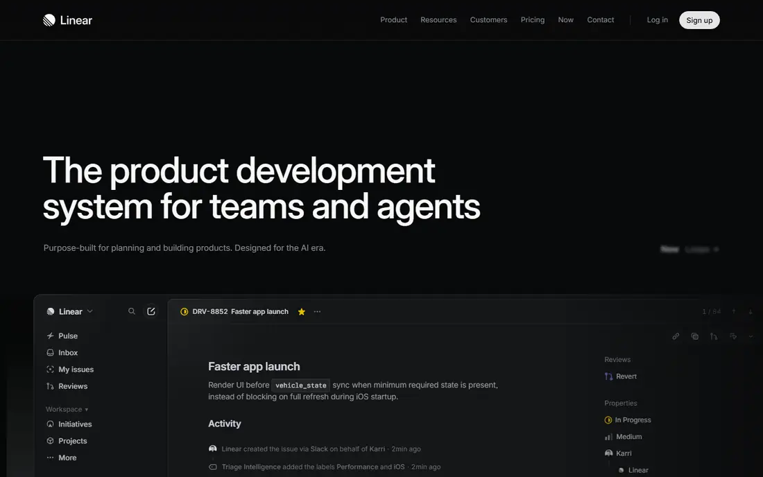
Linear's website stands out for consistency: every page feels like part of the same product, with sharp type, restrained colour, and short, clear copy. The homepage explains what Linear does, who it serves, and how it differs, without burying the product under vague claims. Feature pages use product visuals that match the real app, which helps buyers judge fit before a trial. The trade-off is scope. Linear has a focused product, so its site has less to explain than a large suite such as Apple or Shopify. That focus is also its strength: a buyer can understand Linear in minutes. For teams judging website clarity alone, Linear is one of the best tech company websites for showing how restraint and consistency build trust.
- Highly consistent visual design
- Clear product story
- Fast, readable pages
- Smaller product range to explain, so comparison with larger suites is limited

Figma's website works because it looks and feels like Figma itself, with live-feeling visuals, clear collaboration language, and templates that show real work rather than abstract claims. A visitor can grasp design, prototyping, and team collaboration from the homepage, then move to product pages, pricing, and community resources. That product-led approach suits a tool whose value is visible in its interface. The catch is breadth. Figma now covers design, whiteboarding, slides, and sites, so new visitors may need a moment to find their exact product. Its navigation and product pages help, but a buyer should start from a job, such as interface design or team brainstorming, to avoid wandering across every product at once.
- Homepage feels like the product
- Clear design and collaboration story
- Strong templates
- Broad product range can make first navigation busy for new visitors
Vercel's website speaks directly to developers, with a clear deployment story, framework support, and fast routes to documentation and templates. A developer buyer can move from homepage to docs to a starter template in a few clicks, which matches how developers actually evaluate a platform. Its pages balance product explanation with technical detail, rather than hiding docs behind sales forms. The honest catch is audience. Vercel's technical tone suits developers well but may feel dense for a non-technical buyer who wants a simple business summary first. For a software company website judged on developer buyer information, Vercel is strong; for a general business audience, its clarity depends on the visitor's technical background.
- Developer-focused clarity
- Fast docs access
- Clear deployment story
- Technical tone may feel dense for non-developer buyers
Notion's website explains a flexible product in simple language, with templates and use-case pages that show how docs, wikis, and projects fit different teams. That template-led approach helps a buyer who knows their job, such as team docs or project planning, to see a relevant example fast. Pricing is easy to find, and the free plan gives a clear next step for a trial. The trade-off is generality. Because Notion serves many jobs, its homepage can feel broad on a first visit, and a buyer may need to click into a use case to see a precise fit. Its templates and customer stories close that gap well, provided the visitor starts from a specific team need rather than a general browse.
- Simple, readable product story
- Strong templates
- Clear pricing page
- Broad use cases can make the homepage feel general at first glance
Apple's website manages an enormous product range with clean navigation, consistent product pages, and clear support routes. A buyer can find a Mac, iPhone, or software product, compare models, check tech specs, and reach support without wading through clutter. That scale management is why Apple belongs in a list of best software company websites, even though it is known first as a hardware company. The catch is software depth. For buyers seeking detailed software documentation, Apple software detail can sit deeper inside product and support pages than on a developer-first site such as Vercel or GitHub. For general buyers, however, Apple's clarity, product comparison, and support access set a high standard for large company websites.
- Clean navigation at huge scale
- Strong product pages
- Clear support paths
- Software detail can sit deep inside product pages for some buyers
GitHub's website explains code hosting, collaboration, and AI-assisted development with a developer-first voice, plus clear routes to documentation, security information, and pricing. Trust signals such as security pages, enterprise options, and customer stories help buyers in larger organisations judge GitHub for team and enterprise use. Its homepage balances product news with a clear explanation of what GitHub does. The honest catch is complexity for newcomers. GitHub covers personal, team, and enterprise use, plus actions, packages, and AI tools, so a first-time visitor may need to narrow by plan or use case. Its pricing and docs pages help, but a buyer should start from their team size and workflow rather than reading every product page in order.
- Clear developer product story
- Strong docs and security pages
- Visible pricing
- Product range and enterprise options can feel complex for new visitors
Shopify's website is built around merchant jobs, with paths for starting, selling online, selling in person, and growing a store. That job-based navigation helps a buyer find relevant features, pricing, and examples without needing to know Shopify product names in advance. Its trial route is clear, and its help centre covers setup, payments, and selling in plain language. The trade-off is range distraction. Shopify's app store, themes, and partner pages are large, and a new merchant can spend time browsing add-ons before choosing a core plan. For buyers, the best path is to start from a selling job, check the core plan page, and treat apps as later additions rather than first decisions.
- Merchant-focused paths by business type
- Clear trial route
- Strong help centre
- App and theme range can distract from core product choice
Slack's website tells a clear team story: channels, messaging, integrations, and AI summaries that help teams work in one place. Its pricing page is easy to compare across plans, and its customer examples show real team workflows rather than abstract claims. For a buyer evaluating team chat, Slack's site gives a fast, readable overview with a clear free-plan next step. The catch is enterprise depth. Larger organisations that need detailed admin, security, and compliance information will find it, but that detail sits deeper in the site than the main product story. For most team buyers, Slack's clarity and straightforward pricing comparison make it a strong example of a software company website done well.
- Clear team and channel story
- Easy pricing and comparison
- Strong customer examples
- Product depth for large enterprises sits deeper in the site
How we picked these
We reviewed official homepages, product pages, pricing pages, documentation links, and support routes for each company in October 2026. We judged design consistency, clarity of the product story, ease of finding pricing and docs, and quality of buyer paths such as trials, demos, and help centres. We listed companies themselves, not website builders, and we did not rank sites on awards, traffic, or popularity alone.
What makes a software website strong for buyers
Explain the product in one screen
A strong homepage states what the product does, who it serves, and what to do next, without forcing a visitor to read several pages first. Product visuals should match the real product, and copy should name concrete jobs rather than vague benefits. If a homepage needs a glossary to understand, it has failed its first job.
Make pricing and docs easy to find
Buyers judge trust by how easy it is to find pricing, documentation, security information, and support. Hidden pricing, docs behind sales forms, and vague plan comparisons slow decisions and push buyers to rivals. The strongest sites in this guide keep pricing and docs one click from the homepage and keep plan differences in plain language.
Guide, do not trap, the visitor
Good sites guide visitors to a trial, demo, template, or help page that fits their job, and let them leave and return without pressure. Aggressive pop-ups, forced demos for basic information, and endless sales gates hurt trust. The best software websites in this guide balance marketing with useful paths, so a buyer can learn, trial, and decide at their own pace.
Frequently asked questions
What are the best software company websites?
Stripe, Linear, and Figma are strong overall picks for design, clarity, and buyer information, with Vercel and GitHub strong for developer buyers. The best software companies websites depend on the buyer: Stripe suits payments buyers, Linear suits product teams, and Shopify suits merchants. Judge a site by how fast it explains the product and leads to pricing and docs.
Are these website builders?
No. This guide lists software companies with strong official websites, not website builders. Website builders help you create a site, while the companies here are judged on their own official sites as buyer tools. If you need a builder, that is a different product category with different criteria.
What makes a tech company website good?
A good tech company website explains the product fast, shows real product visuals, makes pricing and documentation easy to find, and guides visitors to a trial or support page. Design consistency, readable copy, and clear navigation matter more than flashy effects. The best tech company websites balance marketing with useful information for buyers at different stages.
How do I learn from these websites for my own site?
Study one site per job: Stripe for pricing paths, Linear for design consistency, Figma for product-led visuals, and GitHub for developer docs and trust pages. Note how each homepage states the product job, where pricing and docs sit, and how trials are offered. Then apply those patterns to your own product story, rather than copying visual details that do not fit your buyers.
Do these websites offer free trials or free plans?
Visiting each website is free, and most companies in this guide also offer a free plan or trial for their product, with details on their pricing pages. Check the pricing page for each company, since free plan limits and trial lengths vary by product. A free website visit does not always mean the full product is free.
Why is Apple included in a software website list?
Apple is included because its official website manages software, services, and hardware at scale with clean navigation and clear support paths. Many buyers first meet Apple software through its website, and its product comparison and support routes set a useful standard. The guide judges the website as a buyer tool, not only the software product behind it.
Sources
See where you really rank - block by block
ProMapRanker scans Google Maps across a grid of your service area. Simple monthly plans from $19, white-label on every plan.
Start freeKeep reading
 zscaler alternatives
Best Zscaler Alternatives in 2026
Looking for zscaler alternatives? We compare 9 SASE and zero trust platforms on architecture, data protection, pricing, and fit for your network and team.
Read → zapier alternatives free
Best Zapier Alternatives Free in 2026
Nine automation tools for zapier alternatives free in 2026, all with genuinely free tiers, plus free plan limits, starting prices and upgrade paths explained.
Read → which platform is best for online reputation
Which Platform Is Best for Online Reputation in 2026
Wondering which platform is best for online reputation? We compare 8 review, listing, and response tools for small and multi-location businesses and agencies.
Read →