 ProMapRanker
Best Construction Company Website Design in 2026


Large project storytelling · Pricing starts at: See website
Key takeaways
- This article compares construction companies with the strongest official websites, not website builders, so you can learn from real builder sites.
- Turner, Skanska and Bechtel lead on project storytelling, with large project galleries, clear service pages and easy contact routes.
- DPR, Hensel Phelps and Clark show how safety, people and project detail can build trust without cluttering the homepage.
- The best sites share the same habits: clear services, real project photos, a simple contact path and proof of scale, safety and expertise.
Quick comparison
| Pick | Great for | Pricing starts at | Free tier | |
|---|---|---|---|---|
| Turner Construction | Large project storytelling | See website | No | Visit |
 Skanska USA | Clear services and sustainability | See website | No | Visit |
 Bechtel | Global project scale | See website | No | Visit |
 DPR Construction | People and project detail | See website | No | Visit |
 Hensel Phelps | Plain, confident project pages | See website | No | Visit |
 Clark Construction | Project galleries and news | See website | No | Visit |
 Balfour Beatty US | Regional project coverage | See website | No | Visit |
 Mortenson | Energy and building projects | See website | No | Visit |
 Gilbane | Company history and expertise | See website | No | Visit |
 McCarthy | Simple navigation and services | See website | No | Visit |
The best construction company website design
We compared the official websites of leading US construction companies, looking at navigation, project pages, service clarity, trust signals and contact routes. This is a design review of builder websites, not a list of web design agencies. Prices below are listed as See website because these are company sites, not products for sale.
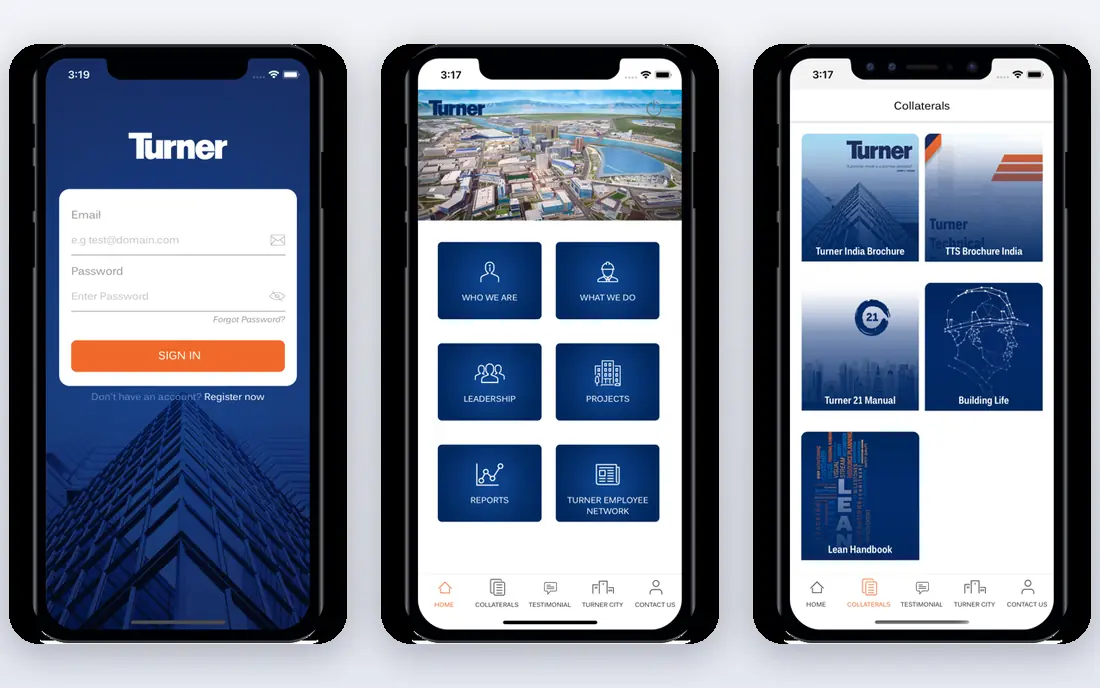
Turner Construction runs one of the clearest large-builder websites in the US. Its homepage leads with major projects, its service and market pages explain what the company builds, and its project pages pair photos with location, size and scope. For a client researching a builder, that structure answers the first questions fast: what do you build, where, and at what scale.
The catch is volume. A company of Turner's size has a lot to show, and some pages carry more content than a small visitor needs. Still, the navigation keeps services, projects and contact routes easy to find, which is the core test for any construction site. We would study Turner first for project storytelling at scale.
- Large, well-organised project gallery
- Clear service and market pages
- Strong company and careers sections
- Scale of content can feel heavy on mobile
- Project depth varies by entry
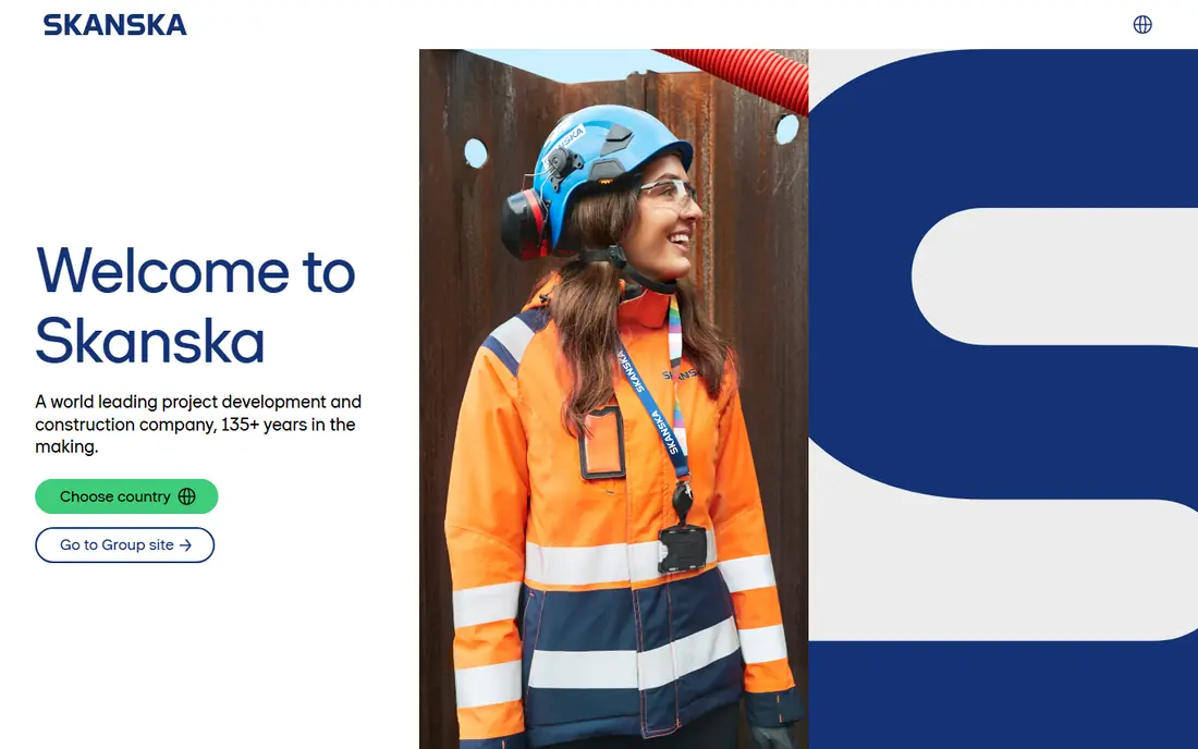
Skanska USA benefits from a clean, group-wide design that keeps services, projects and sustainability in plain view. Its building construction and civil pages are easy to separate, and its project pages explain scope without jargon. Sustainability and safety, which matter to public and corporate clients, are given proper pages rather than buried in a news post.
The trade-off is group scale. Skanska is a global company, so US visitors sometimes need an extra click to reach the right regional page. That is a minor cost for a site that otherwise models clear, calm design. We would study Skanska for service clarity and sustainability presentation.
- Clean layout with clear service divisions
- Sustainability and safety content is easy to find
- Strong project case studies
- Global structure means some US pages sit inside a larger group site
- Navigation needs a click or two to reach local detail
Bechtel's website is built to show scale. Its project pages cover energy, infrastructure and government work across countries, with photos, scope and outcomes that help a large client judge capability. Market pages explain sectors in plain terms, and news and insights show current work without turning the homepage into a blog feed.
For a small local builder, Bechtel's formal tone may feel distant, and its contact path is clearly aimed at large programmes. As a design example, though, it shows how to present huge, complex work in a readable way. We would study Bechtel for global project presentation and sector pages.
- Strong project and market storytelling
- Clear global scale and expertise
- Well-structured news and insights
- Design leans corporate, so small local clients may find it formal
- Contact routes are geared to large projects
DPR Construction uses a people-led design that stands out among large builders. Its site pairs project detail with team, values and safety content, which helps clients judge culture as well as capability. Project pages are detailed, with photos and scope, and the site avoids the cold, corporate feel that some builder sites fall into.
The style is a choice, not a flaw, but it will suit some clients more than others. A buyer who wants only hard numbers may prefer a plainer layout. As a design model, DPR shows how personality and project proof can sit together without losing clarity. We would study DPR for culture, careers and project detail.
- Warm, people-led design
- Detailed project pages
- Clear values, safety and careers content
- People-led style may suit some clients more than others
- Project search needs filtering to find local work
Hensel Phelps offers a plain, confident website that does the basics very well. Services and markets are easy to find, project pages show photos and scope, and company history gives context without taking over the homepage. For a client who wants facts fast, that restraint is a strength.
The site is less adventurous than DPR or Turner in visual style, and it offers fewer interactive tools. That matters little for a builder site, where trust comes from clear projects and contact routes. We would study Hensel Phelps for a traditional, well-organised builder site that never confuses the visitor.
- Straightforward navigation
- Strong project galleries
- Clear services, markets and company history
- Design is more traditional than some rivals
- Interactive features are limited
Clark Construction presents its work with strong project imagery and clear market pages, covering buildings, infrastructure and related services. Its news section shows current projects and milestones, which helps a prospective client see that the company is active now, not just historically. Navigation keeps services, projects and company pages in expected places.
The large project list can take time to filter by market or location, and some pages are text heavy. Those are manageable issues for a site of this scale. We would study Clark for project galleries, news rhythm and market clarity.
- Strong project imagery
- Clear market and service pages
- Regular news that shows current work
- Large project list needs filtering
- Some pages carry a lot of text
Balfour Beatty US gives American clients a clear entry point into a global builder. Its site covers US building and civil work, with regional projects, safety content and sustainability pages that help public and private clients judge fit. The US focus keeps the homepage relevant for American buyers, rather than mixing global work without context.
As with Skanska, the global group structure adds a layer of navigation. Visitors may need to check whether a page is US-specific or group-wide. That aside, the site models how a global builder can present a clear local face. We would study Balfour Beatty US for regional coverage and local trust signals.
- Clear US focus within a global group
- Regional project coverage
- Safety and sustainability pages
- Group structure adds extra navigation layers
- Some content is shared with the global site
Mortenson's website makes its energy work easy to find alongside building and infrastructure projects, which suits clients in renewable energy, data centres and commercial building. Project stories use photos and clear scope notes, and service pages explain what Mortenson builds without heavy jargon. That balance helps a diverse client base find its relevant section fast.
Energy content is prominent, so a pure building client may need to look past it to find comparable building projects. That is a minor navigation point, not a design failure. We would study Mortenson for sector clarity and project storytelling across different markets.
- Clear energy, building and infrastructure sections
- Strong project stories
- Good use of photos and video
- Energy focus may overshadow building work for some visitors
- Project depth varies
Gilbane uses its long history as a trust signal without letting it dominate the site. Service and market pages are clear, project content is well organised, and insights show expertise in building, facilities and related services. For a client who values a stable, long-lived builder, that history, paired with current projects, is persuasive.
The design itself is traditional, and the homepage can feel full at first glance. Neither point blocks the core tasks of finding services, projects and contact details. We would study Gilbane for history, expertise pages and a steady, credible tone.
- Long company history presented clearly
- Strong service and market pages
- Useful insights and project content
- Design is traditional
- Homepage carries a lot of information at once
McCarthy rounds out this list with a simple, direct website that puts services, markets and projects where visitors expect them. Its safety and company content support the project work, and its project pages give enough detail for a first-stage client review. For a builder site, that predictability is a virtue, because clients should not have to learn a new layout to find a phone number or a project example.
The restrained visual style will not win a design award for flair, but it wins on usability. We would study McCarthy for navigation simplicity and for how a large builder can stay readable without visual clutter.
- Simple, direct navigation
- Clear service and market structure
- Strong project and safety content
- Visual style is restrained
- Fewer interactive features than some rivals
How we picked these
We reviewed official builder websites for navigation clarity, service pages, project galleries, trust signals such as safety and history, and contact routes. We favoured large US builders with complete, active sites in 2026 and a clear project record. We did not include web design agencies in this list, because the topic here is construction company websites themselves and what makes them work.
What to learn from these sites
Start with the visitor's first question. A client, subcontractor or jobseeker should know within seconds what you build, where you work and how to contact you. Put services, markets and contact details in the main navigation, and keep the homepage focused on projects and proof, not slogans.
Project pages that build trust
A strong project page needs a real photo, location, size or scope, market type and a short description of the work. Add client type where you can, and avoid stock-style images that could belong to any builder. A small number of detailed projects beats a long list of thin entries.
Services, safety and people
Service pages should explain each service in plain terms, with example projects linked from the page. Safety, sustainability and careers pages matter too, because clients, partners and staff all judge a builder on them. Keep each page focused, and link related projects rather than repeating the same text.
Contact and next steps
Every service and project page should lead to a clear next step, such as a contact form, regional office page or request for qualifications. Test the site on a phone, check load speed and confirm that forms, phone numbers and office pages are current. A beautiful site that hides contact details fails its main job.
Frequently asked questions
What is the best construction company website design?
Turner Construction, Skanska USA and DPR Construction are strong models, for different reasons: Turner for project scale, Skanska for service clarity and DPR for people-led detail. The best design for your company depends on your markets, project size and the clients you want to attract.
What makes a good website for a construction company?
A good construction website shows real projects with photos and scope, explains services in plain terms, proves safety and expertise, and makes contact easy. Clear navigation, fast loading and mobile readability matter more than visual effects.
Should a construction company hire a web design agency?
A design agency can help with structure, photos, copy and technical work, but the company must supply real project photos, scope details and service facts. The sites in this list work because their content is real, not because of design tricks alone.
How much does a construction company website cost?
Costs vary by size, photos, copy, integrations and ongoing updates, so we list price as See website for these company sites. A small builder site costs far less than a large multi-market site with project databases and regional pages, so get a scoped quote based on your pages and content needs.
Do construction websites need project galleries?
Yes, project galleries are the core proof for a builder. Clients judge capability from past work, so include photos, location, market, size and scope for each project. A gallery without scope details looks good but tells a client very little.
How often should a construction website be updated?
Update project pages as major projects complete, refresh news at least monthly and check contact, office and service pages each quarter. An out-of-date site suggests out-of-date work, while regular project updates show current activity.
Sources
See where you really rank - block by block
ProMapRanker scans Google Maps across a grid of your service area. Simple monthly plans from $19, white-label on every plan.
Start freeKeep reading
 zscaler alternatives
Best Zscaler Alternatives in 2026
Looking for zscaler alternatives? We compare 9 SASE and zero trust platforms on architecture, data protection, pricing, and fit for your network and team.
Read → zapier alternatives free
Best Zapier Alternatives Free in 2026
Nine automation tools for zapier alternatives free in 2026, all with genuinely free tiers, plus free plan limits, starting prices and upgrade paths explained.
Read → which platform is best for online reputation
Which Platform Is Best for Online Reputation in 2026
Wondering which platform is best for online reputation? We compare 8 review, listing, and response tools for small and multi-location businesses and agencies.
Read →