 ProMapRanker
Best Company Websites in 2026

Key takeaways
- The best company website answers three questions fast: what it does, who it is for and what to do next.
- Stripe and Linear show how clear product visuals and short copy can beat long pages of claims.
- Notion and Figma prove that a free plan and real product examples build trust faster than slogans.
- Airbnb and Duolingo show how friendly design can still guide millions of users to a clear action.
- Companies with the best websites keep navigation simple, even when the product behind the site is complex.
Quick comparison
| Pick | Great for | Pricing starts at | Free tier | |
|---|---|---|---|---|
 Stripe | Clear payments product site | Free | Yes | Visit |
 Linear | Minimal product-led design | Free | Yes | Visit |
 Notion | Product visuals and use cases | Free | Yes | Visit |
 Figma | Design tool clarity | Free | Yes | Visit |
 Airbnb | Marketplace trust and search | Free | Yes | Visit |
 Apple | Product showcase at scale | See website | No | Visit |
 Spotify | Simple consumer conversion | Free | Yes | Visit |
 Duolingo | Playful learning conversion | Free | Yes | Visit |
The best company websites
These are the best company website designs to study, chosen for clarity rather than decoration. Each site below makes its product easy to understand, and each one gives a lesson a small business can copy without a large design budget.
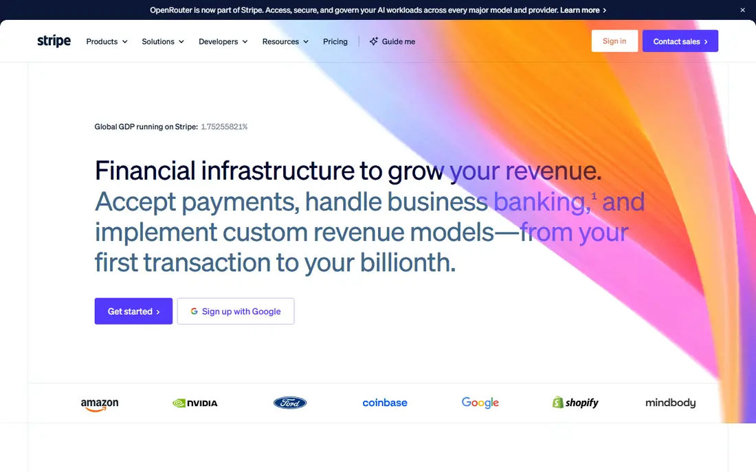
Stripe is often cited first among the best company websites, and the reason is clarity. The homepage states what Stripe does, shows product areas in short blocks and leads visitors to documentation, pricing or a start button without forcing them through a long sales story. For a payments company, that restraint builds trust, because the product is technical and buyers need facts, not hype.
The site is dense, and a visitor who only wants a simple price may need to click through to find the right plan. That depth is also a strength for developers, who are a core Stripe audience. For any business selling a technical product, Stripe is the model for leading with explanation and proof.
- Explains a complex product in plain steps
- Strong documentation links
- Clear pricing path
- Depth can overwhelm first-time visitors
- Enterprise pricing needs a sales talk

Linear takes the opposite approach to a busy corporate site: a dark, quiet homepage, a short headline and product visuals that do the talking. Visitors can see the issue tracker in action within seconds, which tells a software team more than a paragraph of claims. The navigation stays small, and the copy stays short, which keeps attention on the product.
The trade-off is that a non-technical visitor may not grasp every feature at first glance. Linear is built for product teams, and it speaks their language. For a company with a strong product, Linear shows that showing the tool beats describing it at length.
- Fast, focused homepage
- Real product screenshots
- Minimal clutter
- Assumes visitors know issue tracking
- Less hand-holding for beginners
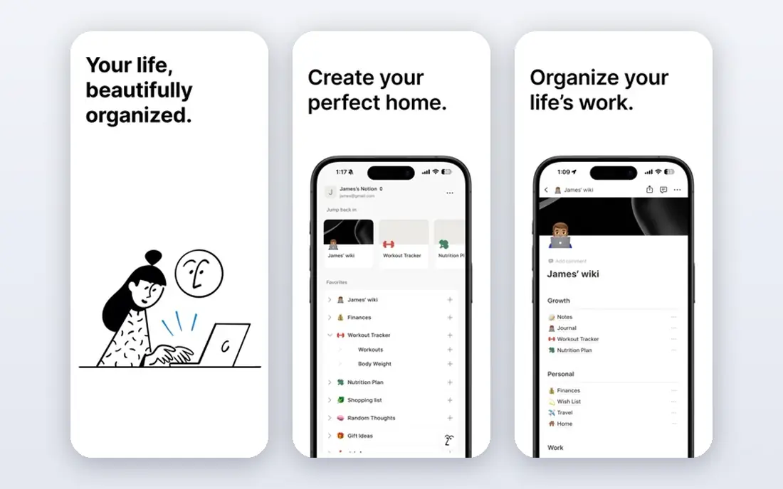
Notion has a hard job: it is a notes app, a docs tool, a wiki and a project tracker at once, yet its homepage still feels organised. It does this by grouping use cases by team and job, so a student, a startup and a large team can each find a relevant path. Templates and real examples help visitors picture their own work inside Notion, which is more persuasive than a feature list.
Breadth is also the weakness. A first-time visitor may wonder whether Notion is for notes, projects or publishing, and the answer is all three. That breadth works once a user starts, but the homepage must work harder to guide them. As a study in organising a broad product, Notion is excellent.
- Clear use-case sections
- Free plan lowers the trial barrier
- Strong templates
- Very broad product can confuse new users
- Homepage tries to serve many audiences
Figma is a design tool, and its site succeeds by showing collaboration rather than just listing features. Visitors see how teams edit together, share files and hand work to developers, which is the real reason teams switch to Figma. Community files and templates add social proof, because visitors can see work made by real users.
Non-designers may find some terms unfamiliar, and the difference between Figma Design and FigJam needs a moment to understand. For a business selling to a professional audience, Figma shows how to lead with the workflow, not the tool, and how a free plan can turn a visit into a trial.
- Shows collaboration clearly
- Free starter plan
- Strong community examples
- Design jargon can exclude non-designers
- Pricing tiers need a close read
Airbnb is one of the best website companies to study for trust, because strangers book homes from strangers through this site. The homepage puts search first, then uses photos, reviews, host details and clear cancellation terms to reduce doubt. That trust layer is the product, and the design treats it that way, with ratings and policies easy to find.
Fees and total price can still surprise a guest late in checkout, which is a common complaint about marketplaces. Airbnb has improved price display, but travellers should still check the total before confirming. For any marketplace or booking business, Airbnb is the lesson in making trust visible.
- Search-first design
- Strong host and guest trust signals
- Clear booking steps
- Search results vary by location
- Fees appear late in the booking flow
Apple runs one of the most visited company sites in the world, and its strength is focus. Each product gets a clean showcase with large imagery, short copy and one clear next step, whether that is learning more or buying. The site never feels crowded, even though Apple sells many products, because each page sticks to one story.
The site is also marketing-led, so a buyer who wants detailed specs or comparisons must dig deeper or visit a store page. Small businesses cannot copy Apple budgets, but they can copy its discipline: one page, one product, one action. That focus is what makes Apple a useful model despite its scale.
- Stunning product imagery
- Very simple navigation
- Consistent global experience
- Little pricing detail on the homepage
- Marketing-led rather than explanatory
Spotify keeps its homepage simple: listen free, or compare premium plans. That clarity works because most visitors already know Spotify, so the site does not need to explain music streaming from scratch. Plan comparison is short, and the free tier removes the risk of trying it, which is why so many visitors convert.
The site says less about podcasts, audiobooks and new features than a power user might want, but that detail lives deeper in the site. For a consumer business with a free tier, Spotify shows the value of one offer, one comparison table and no clutter in between.
- One clear free offer
- Simple plan comparison
- Strong brand personality
- Homepage says little about the catalogue depth
- Premium benefits need a click
Duolingo is the most playful site on this list, and that playfulness is deliberate. Bright colours, a friendly mascot and a language picker make starting feel easy, which matters for a learning product where the first barrier is simply beginning. The free plan is front and centre, so a visitor can start a lesson without a card or a long signup.
That style would not suit a law firm or a bank, and the premium upsell becomes clearer only after signup. The lesson still transfers: match the design to the feeling you want a visitor to have. Duolingo wants learners to feel that language learning can be fun, and every part of its homepage supports that idea.
- Friendly, distinctive design
- Clear free start
- Language choice is immediate
- Playful style may not suit formal brands
- Premium upsell appears after signup
How we picked these
We compared official homepages for well-known companies, judging clarity of message, ease of finding the next step, use of real product visuals and trust signals such as pricing, reviews and documentation links. We favoured sites that a small business can learn from, not just sites with large design budgets. We did not claim hands-on testing, and we based our notes on the public homepages as they appear in 2026.
What makes a company website work
A strong company website starts with a headline that says what the company does and who it serves, in plain words. The next section should show the product or the result, not a list of adjectives. Navigation should stay short, with the most important actions visible: start free, see pricing, book, contact or buy. Trust signals belong near those actions, such as customer logos, reviews, clear pricing or a help centre link.
Speed and mobile design matter as much as looks. Most visitors will first see a site on a phone, so test the homepage on a small screen and cut anything that slows it down. Finally, give every page one job. A homepage that tries to sell, recruit, explain and announce news at once will do none of those jobs well. Pick the main job, and let other pages handle the rest.
Lessons small businesses can copy this week
Copy the structure, not the budget. Write a one-sentence headline, add a real photo or screenshot, list three benefits in plain words and put one clear button under them. Add a pricing link, a contact method and one proof element, such as a testimonial or a client logo. That simple structure beats a beautiful site that leaves visitors unsure what to do next.
Frequently asked questions
What is the best company website for inspiration?
Stripe is a strong all-round inspiration for a technical product, while Linear suits a product-led team and Airbnb suits a marketplace. The best company website for you depends on your business type, so study two or three sites in your own sector and note what each one does first on its homepage.
What do companies with the best websites have in common?
They answer what they do, who they serve and what to do next within seconds. They use real product visuals, keep navigation short and place trust signals near the main action. They also load fast on mobile and avoid long blocks of jargon.
How much does a good company website cost?
A focused site can be built with a website builder for a modest monthly cost, while a custom design from an agency can cost thousands. The cost depends on page count, design complexity, content and integrations. Start with a clear structure and a builder, then invest in custom design once the message is proven.
Should a small business copy Apple or Stripe?
Copy their structure, not their scale. Apple teaches focus on one product per page, and Stripe teaches clear explanation and documentation links. A small business should adapt those ideas to its own budget, audience and product, rather than copying the visual style directly.
Do best company website designs need video?
No. Video can help for a product that is hard to explain, but a clear headline, a screenshot and a short demo clip often work better and load faster. Use video only when it shows something words and images cannot, and keep it short.
Sources
See where you really rank - block by block
ProMapRanker scans Google Maps across a grid of your service area. Simple monthly plans from $19, white-label on every plan.
Start freeKeep reading
 zscaler alternatives
Best Zscaler Alternatives in 2026
Looking for zscaler alternatives? We compare 9 SASE and zero trust platforms on architecture, data protection, pricing, and fit for your network and team.
Read → zapier alternatives free
Best Zapier Alternatives Free in 2026
Nine automation tools for zapier alternatives free in 2026, all with genuinely free tiers, plus free plan limits, starting prices and upgrade paths explained.
Read → which platform is best for online reputation
Which Platform Is Best for Online Reputation in 2026
Wondering which platform is best for online reputation? We compare 8 review, listing, and response tools for small and multi-location businesses and agencies.
Read →