 ProMapRanker
Best App Onboarding Experiences in 2026

Key takeaways
- Duolingo leads for instant value, since new users start a lesson before creating an account.
- Slack, Canva, and Notion show value through action, by guiding users to a first channel, design, or page rather than a tour.
- Headspace and Spotify personalise the first run with goals and tastes, which shapes what users see next.
- Dropbox, Grammarly, and LinkedIn keep onboarding short, with one clear action or a visible progress cue.
- The best onboarding experiences share a pattern: one goal, one first success, and no long setup before value appears.
Quick comparison
| Pick | Great for | Pricing starts at | Free tier | |
|---|---|---|---|---|
 Duolingo | Instant first lesson | Free | Yes | Visit |
 Slack | Team first channel setup | Free | Yes | Visit |
 Headspace | Guided first session | Free | Yes | Visit |
 Canva | Template first design | Free | Yes | Visit |
 Notion | Personalised workspace setup | Free | Yes | Visit |
 Dropbox | First file action | Free | Yes | Visit |
 Spotify | Taste based personalisation | Free | Yes | Visit |
 Grammarly | Immediate live demo | Free | Yes | Visit |
 LinkedIn | Profile completion progress | Free | Yes | Visit |
The best app onboarding experiences
We chose apps that are often cited for strong onboarding, and that you can still use today to see the pattern for yourself. Each app below is a real product with a free tier, not just a design example. We describe what the first run does, why it works, and where it can frustrate new users.
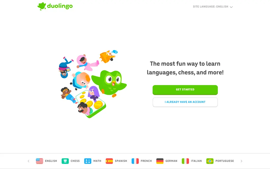
Duolingo lets new users pick a language, set a goal, and start a short lesson before asking for an account. That order matters, because the user experiences the core product within a minute, rather than reading about it. Placement options and goal prompts then tailor the path, so the next lesson feels personal rather than generic.
The trade-off is that streaks, points, and leagues can pull attention away from steady learning. Some users chase a streak rather than review weak words. Still, for onboarding, Duolingo is the clearest example of deferred account creation done well, and our pick for the best onboarding experience overall.
- Lesson before account creation
- Goal setting and placement options
- Clear progress and streak cues
- Gamification can distract from learning goals
- Free tier includes ads and mistake limits in some courses
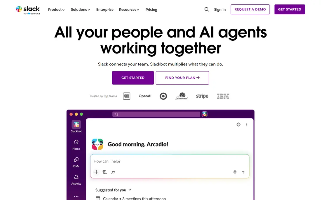
Slack guides a new team through creating a workspace and a first channel in a conversational flow, with Slackbot modelling how messaging works. Instead of an empty screen, new users send a first message, see channels form, and understand the product by using it. That action based start helps teams reach a first shared conversation fast.
The limit is social. Slack only feels valuable once teammates join and start posting, so a solo user may not see the point at first. Channel names, threads, and workspace settings also take a little learning. For team onboarding, Slack remains a strong example of progressive setup that builds toward a shared habit.
- Step by step workspace and channel setup
- Slackbot guides the first interaction
- Team value appears quickly
- Full value needs teammates to join
- Channel and workspace concepts take time for new users
- Free plan limits history
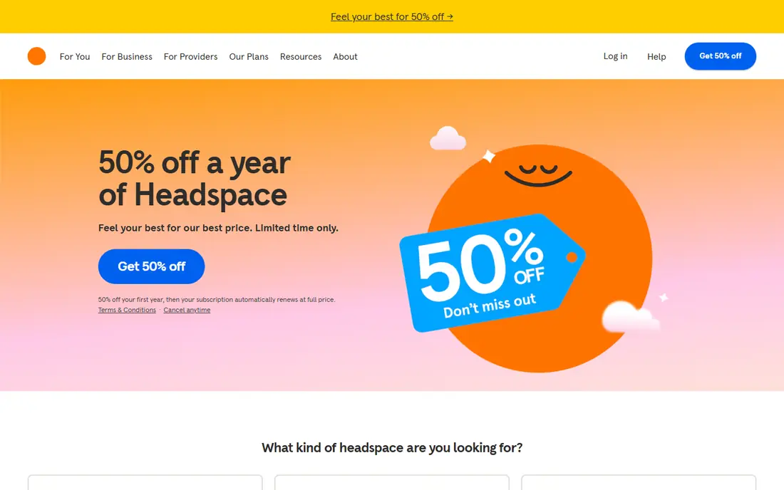
Headspace starts by asking about goals, such as sleep, stress, or focus, then guides new users into a short first session. The calm visuals and voice guidance match the product itself, so onboarding feels like a sample of the benefit, not a separate tutorial. That alignment helps users understand what Headspace is for within a few minutes.
The full library needs a subscription, so free users should check which sessions stay available before they settle into a routine. Some users may also find the slow pace frustrating if they prefer to browse quickly. For wellness apps, Headspace shows how tone and a first session can do more than a feature tour.
- Calm guided first session
- Goal based personalisation
- Soothing visuals and voice guidance
- Full library needs a subscription
- Calm tone may feel slow for users who want quick setup
- Content is audio led
Canva asks what you want to make, then offers templates for that use case, so a new user can finish a first design in minutes. That template first flow removes the blank canvas problem, which is the main reason many creative tools lose new users. Social proof from community designs also shows what is possible without a long tutorial.
The catch is originality. A template based first design can look familiar, and some premium assets and AI features need a paid plan. The home screen is also busy, with many formats competing for attention. For creative tools, Canva is still a leading onboarding example, because value arrives as a finished design, not as a lesson about design.
- Template first start with a finished design in minutes
- Guided prompts by use case
- Free tier covers core design
- Template reliance can limit original design
- Some assets and AI features need a paid plan
- Home screen can feel busy
Notion personalises setup by asking how you plan to use it, then offers templates and a starter workspace for notes, tasks, or docs. That approach avoids a one size fits all tour, and gives new users a page they can edit right away. The product grows with the user, from a simple note to a full workspace, which suits long term use.
Flexibility is also the weakness. New users can feel lost among databases, properties, and views, and some features only make sense after weeks of use. Notion onboarding works best when you start with one template and one page, then add structure slowly. For productivity tools, it shows how personalisation can replace a generic walkthrough.
- Setup tailored by use case
- Templates for notes, tasks, and docs
- Flexible pages that grow with the user
- Flexibility can overwhelm new users
- Many features need discovery over time
- Team setup is more complex
Dropbox keeps onboarding to a single action: upload or add a first file, then see it sync. That simplicity suits a utility product, where users already know what they want to do and do not need a tour. The folder model is familiar, so new users understand where files live without learning a new system.
The simplicity also means less guidance for collaboration, sharing permissions, and advanced features, which users discover later. Free storage is limited, so heavy users will need a paid plan. For utility apps, Dropbox is a good example of onboarding that gets out of the way and lets the core action speak.
- Simple sign up and first upload prompt
- Files sync across devices
- Clear folder model for new users
- Free storage is limited
- Advanced collaboration features need a paid plan
- Onboarding is simple rather than guided
Spotify asks new users to pick artists and genres, then builds personalised playlists and recommendations from those picks. That taste based start means the home screen feels personal within minutes, rather than showing the same charts to everyone. Discovery features then refine taste as listening history grows.
Free mobile listening includes ads and shuffle limits, which can frustrate users who expect full control. Taste picks are also a starting point, not a perfect profile, so recommendations improve with use. For content apps, Spotify shows how a short preference quiz can personalise an entire product from day one.
- Artist and genre picks shape recommendations
- Personalised playlists appear quickly
- Free tier for music discovery
- Free tier includes ads and shuffle limits on mobile
- Taste picks need refining over time
- Onboarding is brief
Grammarly shows value in the first session by correcting real text as you type, rather than describing grammar features. A new user sees a suggestion, accepts it, and understands the product in seconds. That immediate demo is stronger than a tour, because the benefit is personal and visible right away.
The free tier covers basic spelling and grammar, while tone, clarity, and full suggestions need a paid plan. Browser extension setup also adds a step that some users skip. For browser and writing tools, Grammarly is a clear example of onboarding through a live demo of the core benefit.
- Live correction demo in the first session
- Clear before and after value
- Free tier for basic writing help
- Full tone and clarity suggestions need a paid plan
- Browser extension setup adds a step
- Suggestions need human judgment
LinkedIn centres onboarding on a profile strength meter, which shows how complete a profile is and which sections will improve it. Each completed section adds more visibility and connection value, which gives users a reason to finish setup. Connection prompts then add network value, since a profile alone is less useful without contacts.
The risk is length. Completing every section at once can feel like a chore, and connection prompts can feel pushy if you are not ready to add people. It helps to complete the core sections first, then return to the rest later. For network based products, LinkedIn shows how visible progress can motivate setup without hiding the work involved.
- Profile strength meter shows clear next steps
- Connection prompts build network value
- Free core networking
- Setup can feel long if you complete every section at once
- Connection prompts can feel pushy
- Premium features need payment
How we picked these
We compared onboarding patterns described in product and UX reviews, and kept only apps that are live today with a free tier you can try. We looked for a clear first success, short setup, and personalisation that changes what the user sees next. Apps with long tours, heavy upfront forms, or no clear first action were left out, even when the product itself is strong.
What good onboarding has in common
One goal, one first success
Good onboarding asks for one goal, then guides the user to one success. Duolingo gives a lesson, Canva gives a design, Dropbox gives a synced file, and Grammarly gives a corrected sentence. If a first run asks for five goals and ten settings, most users will leave before they see value.
Personalisation that changes the product
Headspace, Spotify, Notion, and LinkedIn all use early answers to change what appears next. That personalisation should be visible, not hidden in settings. If a user answers questions and then sees the same generic home screen, the setup felt pointless, and trust drops.
Let users skip and return
The best flows let users skip a step, explore, and return later. A forced tour, a long form, or a paywall before any value will lose users who are still deciding. Offer a short path to value first, then invite users to complete their profile, invite teammates, or explore advanced features when they are ready.
Frequently asked questions
Which app has the best onboarding experience?
Duolingo is often cited as the best onboarding experience, because new users start a lesson before creating an account, with goal setting and placement built in. Slack, Canva, and Headspace are also strong, each for a different reason: team setup, template first design, and a guided first session. The best example depends on the product type you are designing for.
What is the best onboarding app for a new product team to study?
Study Duolingo for consumer onboarding, Slack for team onboarding, and Canva for creative tools. Each one shows a different pattern: instant value, progressive team setup, and template first creation. Together they cover most onboarding problems a new product team will face.
What makes a platform with the best onboarding experience different?
A platform with the best onboarding experience gives value before asking for much setup, personalises the next steps, and keeps the first run short. It also lets users skip steps and return later, rather than forcing a long tour. The common thread is respect for the user's time in the first minutes.
How long should app onboarding take?
Most strong examples take under three minutes to reach a first success, with Duolingo and Grammarly taking under a minute. Longer setup should be split into small steps after value appears, such as profile completion in LinkedIn. If onboarding takes longer than the first success is worth, users will leave.
Should onboarding ask for an account first?
Not always. Duolingo shows that letting users try the core product before creating an account can increase engagement, since saving progress becomes a reason to sign up. For team or payment based products, an account may be needed earlier, but the principle holds: show value as early as the product allows.
Sources
- https://www.duolingo.com
- https://slack.com
- https://www.headspace.com
- https://www.canva.com
- https://www.notion.com
- https://www.dropbox.com
- https://www.spotify.com
- https://www.grammarly.com
- https://www.linkedin.com
- https://folge.me/blog/8-onboarding-examples-that-work
- https://www.guidde.com/blog/5-exceptional-onboarding-processes-to-inspire-your-strategy
See where you really rank - block by block
ProMapRanker scans Google Maps across a grid of your service area. Simple monthly plans from $19, white-label on every plan.
Start freeKeep reading
 zscaler alternatives
Best Zscaler Alternatives in 2026
Looking for zscaler alternatives? We compare 9 SASE and zero trust platforms on architecture, data protection, pricing, and fit for your network and team.
Read → zapier alternatives free
Best Zapier Alternatives Free in 2026
Nine automation tools for zapier alternatives free in 2026, all with genuinely free tiers, plus free plan limits, starting prices and upgrade paths explained.
Read → which platform is best for online reputation
Which Platform Is Best for Online Reputation in 2026
Wondering which platform is best for online reputation? We compare 8 review, listing, and response tools for small and multi-location businesses and agencies.
Read →