 ProMapRanker
Best App Onboarding Examples in 2026

Key takeaways
- Duolingo shows value first, with a short first lesson before heavy account setup, which is a pattern many learning apps copy.
- Headspace and Calm show guided choice, asking about goals first so the first session feels personal rather than generic.
- Slack and Canva show learning by doing, placing new users inside a real workspace or design instead of a long tour.
- The best flows are short, specific and tied to one clear first success, not a full tour of every feature.
Quick comparison
| Pick | Great for | Pricing starts at | Free tier | |
|---|---|---|---|---|
 Duolingo | Learning by doing | Free | Yes | Visit |
 Headspace | Guided first session | Free | Free trial | Visit |
 Slack | Learning inside the product | Free | Yes | Visit |
 Canva | Template-first start | Free | Yes | Visit |
 Spotify | Preference-based setup | Free | Yes | Visit |
 Dropbox | Action-based start | Free | Yes | Visit |
 Grammarly | Instant demo value | Free | Yes | Visit |
 Calm | Personalized calm start | Free | Free trial | Visit |
The best app onboarding examples
This is an examples roundup, not a ranking of the apps themselves. Each entry describes what the onboarding flow is publicly described as doing, and what product teams can learn from it. We draw on published onboarding studies and product guides, not on invented screen-by-screen flows we have not seen described. Read each example for the pattern, then adapt that pattern to your own product rather than copying screens.
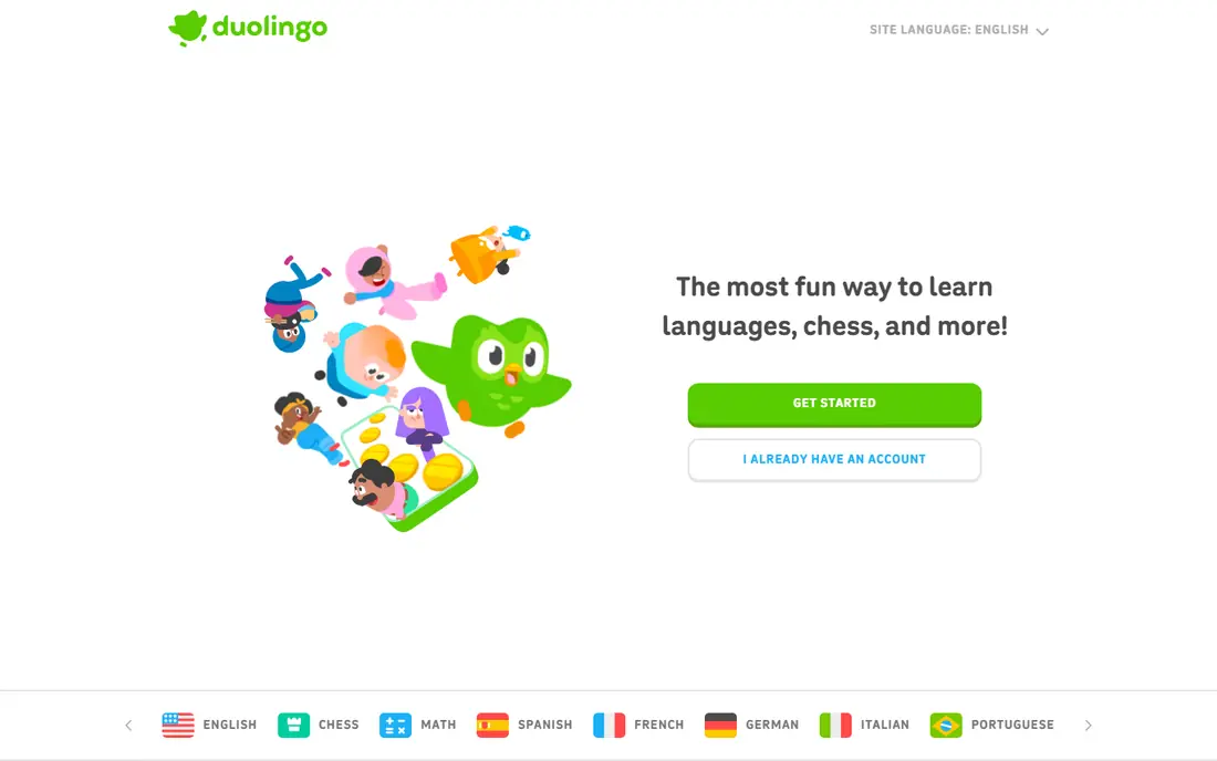
Duolingo is the classic example of value before signup friction. Published onboarding studies describe new users picking a language and reaching a tiny first lesson within a few screens, with a small animation and encouragement when an answer is right. That early win teaches the core loop, which is short exercises with instant feedback, before the app asks for deeper commitment.
The lesson for product teams is to let people taste the product. If your app has a core action that takes under a minute, put that action before account forms, long tours and paywalls where possible. The risk is that later setup screens can still feel long, so keep the path after the first win short and explain why each question matters.
- First lesson arrives fast
- Language and goal choice shape the path
- Progress cues keep momentum
- Long setup can follow the first lesson
- Gamification may distract users who want a plain study tool

Headspace onboarding is described in published studies as starting with a calm moment, including a short breathing screen, before asking about sleep, stress and what brought the user to the app. That sequence sets the tone for meditation and gives the app enough detail to recommend a first session that fits the stated goal. The user has already meditated briefly by the time recommendations appear.
The pattern here is guided choice. Instead of showing a full library on day one, Headspace narrows options to one fitting first step. Product teams can copy the idea by asking two or three goal questions, then showing one clear next action. The weakness to avoid is asking many questions without giving anything back, since each question should change what the user sees next.
- Calm tone from the first screens
- Goal questions shape recommendations
- First session arrives early
- Full library needs a subscription
- Guided tone may feel slow for users who want to browse freely

Slack onboarding guides new users through creating a workspace and a first channel in a conversational, step-by-step flow. Published guides note that Slackbot simulates the messaging experience during setup, so users learn how channels and messages work while they are setting up, rather than reading about them first. The tone stays light, which helps enterprise software feel less formal.
The lesson is to teach inside the product. When your product is a place where people work, let setup create a real, usable space, not an empty shell with a tour overlay. Slack also shows the limit of this pattern: a single user gains little until teammates join, so the flow must push toward inviting others at the right moment, not at every step.
- Guided workspace and channel setup
- Slackbot models how messaging works
- Conversational tone
- Team setup can feel long for a single user
- Value depends on teammates joining
Canva onboarding is widely described as template-first. New users see ready-made designs for common needs, pick one, and edit it directly, which teaches the editor by doing rather than through a separate tutorial. A short guided pass shows how to change text, images and colors in the context of a real design, so the first success is a finished-looking result.
The pattern suits any creative tool. Give people a strong starting point that matches their stated goal, and let editing teach the interface. The risk is choice overload, since a large template library can stall a new user. Canva answer is to surface a small set of popular formats first, then open the full library once the user has made one design.
- Templates give an instant starting point
- Quick tutorial shows editing in context
- Free tier is generous
- Template choice can overwhelm new users
- Advanced features still need learning after the first design
Spotify onboarding is described as preference-based, asking new users to pick artists and genres so recommendations start from real taste rather than a generic chart list. That short setup pays off at once, since the home screen then shows playlists and artists that feel personal. Users can skip picks and explore, but the picks give the system a useful starting point.
The lesson is to ask only for inputs that visibly change the product. Spotify picks change what appears on the home screen, so users see the point of answering. If your onboarding asks for preferences that do not change anything on the next screen, users will notice and drop off. Keep the pick list short, and let users refine taste by listening and saving over time.
- Taste picks shape recommendations fast
- Setup takes only a couple of minutes
- Free tier shows value at once
- Recommendations need time to improve
- Preference picks alone cannot capture changing taste
Dropbox onboarding is described as action-based, with a prompt to upload a first file soon after signup. That single action teaches the core job, which is storing and reaching a file from anywhere, without a tour of every sharing and backup feature. Once the file is in place, the user has a reason to return, install the desktop app, or share a link.
The pattern is useful for utility products. Find the one action that proves value, and guide new users to it in under a minute. The trade is depth: Dropbox users may miss sharing, version history and backup tools unless later prompts surface them at relevant moments. Plan those follow-up prompts for when a user actually needs the feature, not during first setup.
- First upload prompt shows the core job at once
- Setup is very short
- Free tier covers basic storage
- Later features such as sharing and backup need separate learning
- Free storage is limited
Grammarly onboarding is described as an instant demo, showing live corrections on sample text or on the user own writing soon after install. That preview answers the main question, which is whether the tool actually improves writing, without asking the user to trust a feature list. The free tier then lets people use basic corrections in everyday writing.
The lesson is to demo, not describe. If your product improves something the user already does, show that improvement on their own material at the earliest safe moment. Grammarly also shows a limit: automated suggestions are not always right for tone or style, so the flow must make it easy to dismiss a suggestion and keep writing. Trust grows when the demo respects user judgment.
- Live correction demo shows value in seconds
- Free tier works in browser and apps
- Setup is short
- Full writing help needs a premium plan
- Suggestions can annoy users who write in a distinct style
Calm onboarding is described as personalized, asking about goals such as sleep, stress, focus or relaxation, then tailoring recommendations to those answers. Published studies count its flow as shorter than some rivals, with a clear first session for the chosen goal. The calm visuals and sound design also set expectations for the product itself, so onboarding feels like the app rather than a form before it.
The pattern is personalization with a payoff. Each question should narrow the next screen to a fitting session, not just fill a profile. Calm weakness is that users who want to browse the full library may find the guided path slow, so a clear skip or browse option matters. Give guided users a path, and give explorers a door out of it.
- Goal and preference questions shape the home screen
- Sleep and meditation paths are clear
- Calm visual tone
- Full content needs a subscription
- Question flow can feel long if a user wants to browse at once
How we picked these
We compared published onboarding studies, product guides and each app official site. We kept only apps that are live in 2026 and whose onboarding flows are described in more than one public source, so we could describe patterns without inventing screens. We favored varied patterns, including learning by doing, guided choice, template-first starts, preference picks and instant demos, rather than eight versions of the same tour. We did not claim hands-on testing of every flow.
How to use these examples in your own product
Start by naming the one first success your product must deliver. Duolingo first success is a correct answer, Dropbox first success is an uploaded file, and Canva first success is an edited design. Write that success down, then cut every onboarding step that does not lead to it. A shorter flow that ends in real value beats a complete tour that ends in fatigue.
Patterns worth borrowing, and traps to avoid
Borrow learning by doing when your core action is fast, and borrow guided choice when users face a large library. Borrow preference picks only when picks visibly change the next screen. Avoid long tours, tooltip storms and questions that feed a profile nobody sees. Test drop-off by screen, and fix the single screen where most users leave before you redesign the whole flow.
Measuring whether onboarding works
Track activation, not completion. Activation means the user reached the first success, such as a first lesson, first file, first design or first session. Also track return on day two and day seven, since a flow that feels clever but does not bring people back has failed. Ask new users one short question after the first success, and use their answers to cut or reorder steps.
Frequently asked questions
What is app onboarding?
App onboarding is the first-run experience that helps a new user understand an app, set it up, and reach a first success. It can include account setup, goal questions, a guided tour, a demo, or a first task inside the product. Good onboarding is short, specific and tied to value, not a tour of every feature.
Which app has the best onboarding?
There is no single winner, since the best flow depends on the product type. Duolingo is often cited for learning by doing, Headspace and Calm for guided choice, Slack for learning inside the product, and Canva for template-first starts. Pick the pattern that matches your core action, not the app you like most.
How long should onboarding take?
Most strong examples in this list take under three minutes to reach a first success, though some guided flows run longer when questions shape recommendations. Shorter is usually better, but a few extra questions are fine when each one visibly changes what the user sees next. Measure drop-off by screen to find the right length for your product.
Should onboarding ask users to sign up first?
Not always. Duolingo shows value before heavy signup, which lowers friction for new users. Other apps need an account to save work, sync across devices, or meet safety rules. If signup must come first, keep it to one step, explain what the account saves, and return users straight to the first success.
What is progressive onboarding?
Progressive onboarding teaches features over time, when the user actually needs them, instead of showing everything on day one. Dropbox is a good example: the first upload comes first, while sharing and backup prompts appear later at relevant moments. This keeps first setup short and avoids overwhelming new users.
How do I know if my onboarding flow works?
Track whether new users reach the first success, return the next day, and complete a core action in the first week. Also watch where users drop off by screen, and test one change at a time. A flow that raises activation and early return is working, even if fewer users finish every optional step.
Sources
- https://www.duolingo.com
- https://www.headspace.com
- https://www.slack.com
- https://www.canva.com
- https://www.spotify.com
- https://www.dropbox.com
- https://www.grammarly.com
- https://www.calm.com
- https://folge.me/blog/8-onboarding-examples-that-work
- https://userpilot.com/blog/mobile-onboarding-examples/
- https://mobbin.com/blog/the-long-onboarding-a-study-of-1-460-flows
See where you really rank - block by block
ProMapRanker scans Google Maps across a grid of your service area. Simple monthly plans from $19, white-label on every plan.
Start freeKeep reading
 zyte alternatives
Best Zyte Alternatives in 2026
These zyte alternatives cover managed scraping APIs, proxy networks and no code tools for lawful collection from your own or consented sources only in 2026.
Read → zerto alternatives
Best Zerto Alternatives in 2026
Compare the best zerto alternatives for disaster recovery and replication, with recovery targets, cloud options and honest trade-offs for teams in 2026.
Read → zerofox alternatives
Best ZeroFox Alternatives in 2026
We compared 9 zerofox alternatives for brand protection, phishing takedowns, dark web monitoring, and social impersonation, with clear coverage notes.
Read →