 ProMapRanker
Alternatives to CSS Grid in 2026

Key takeaways
- Bootstrap is the fastest route to a complete, ready styled layout for teams that want components included with the grid.
- Tailwind CSS suits teams that want full control over spacing and breakpoints without writing a separate stylesheet for every layout.
- Bulma and Foundation are strong free options when you want a clean grid and readable class names.
- Component libraries such as MUI and Chakra UI make more sense when you already build with React and want layout plus interface parts together.
- No single tool replaces every use of CSS Grid, so pick based on how much design control your team wants to keep.
Quick comparison
| Pick | Great for | Pricing starts at | Free tier | |
|---|---|---|---|---|
 Bootstrap | Complete layouts with components | Free | Yes | Visit |
 Tailwind CSS | Custom utility based layouts | Free | Yes | Visit |
 Bulma | Simple Flexbox layouts | Free | Yes | Visit |
 Foundation | Large responsive sites | Free | Yes | Visit |
 UIkit | Lightweight modular layouts | Free | Yes | Visit |
 Materialize | Material Design layouts | Free | Yes | Visit |
 Chakra UI | React layout and components | Free | Yes | Visit |
 MUI | React apps with a full design system | Free | Yes | Visit |
The best alternatives to CSS grid
CSS Grid is a built in browser layout system, not a product you install, so the options below are frameworks and libraries that give you a grid, spacing tools, and ready parts for building pages. We compared them on layout control, learning curve, component range, and how easy they are to keep tidy on larger projects.
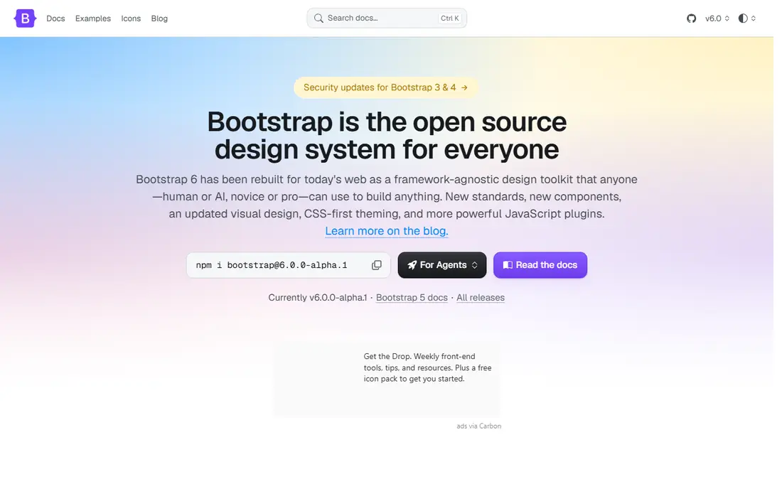
Bootstrap gives you a 12 column grid, responsive breakpoints, and a large set of buttons, cards, forms, and navigation parts in one package. That combination is why it still fits small business sites, admin panels, and marketing pages where speed matters more than a fully custom look. You can change colors, spacing, and fonts through its variables, but the default style is easy to spot if you leave it untouched.
The main trade off is weight and sameness. A simple landing page may not need the whole framework, and teams that want a distinct visual identity will need to spend time on custom styles. For most general projects, though, Bootstrap remains the safest starting point, because new developers can read the classes quickly and find answers to common problems without much searching.
- Large component set
- Clear grid documentation
- Wide community support
- Sites can look alike without custom styling
- The full build can feel heavy for a small page
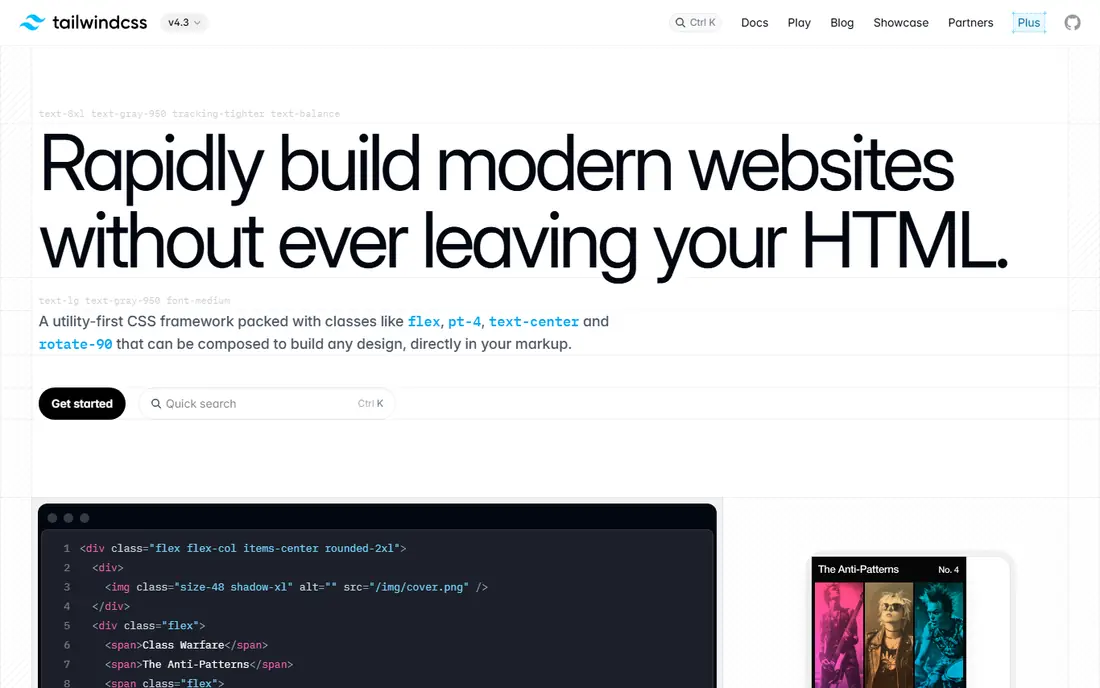
Tailwind CSS takes a different path from Bootstrap. Instead of ready components, it gives you small utility classes for width, padding, margin, display, and grid placement, and you combine them to build the layout you want. That approach suits teams that want a custom design without writing long custom stylesheets, and it works well when the same spacing rules must stay consistent across many pages.
The cost is readability at first glance. A single element can carry many classes, and a team needs agreed patterns so layouts stay consistent. Once those patterns are in place, Tailwind is a strong choice for product interfaces and marketing sites that need precise control and a small final stylesheet.
- Fine control over spacing and breakpoints
- Small production builds
- Strong configuration options
- Long class lists in markup
- A learning curve for teams used to ready components
Bulma is a CSS only framework built around Flexbox, with a column system that is easy to read and quick to learn. It covers the common parts most pages need, including navigation, cards, forms, and modals, without asking you to add JavaScript for the layout itself. That makes it a good fit for static sites, documentation pages, and small projects where a light setup matters.
It does not try to match the full range of larger frameworks, so teams that need complex interactive components will add their own code or pair Bulma with another library. If your main need is a tidy, responsive grid with pleasant defaults, Bulma gives you that with very little overhead.
- Readable class names
- No JavaScript required
- Clean default styling
- Smaller component range than Bootstrap
- Fewer ready templates
Foundation has long been aimed at larger, more complex sites, and it shows in its grid and customization options. You can work with its XY grid, adjust breakpoints through Sass, and build layouts that change in more detailed ways across screen sizes. Its documentation also pays close attention to accessible markup, which matters for public sector sites, education pages, and larger company sites.
The trade off is community size. You will find fewer ready templates and third party themes than for Bootstrap or Tailwind, and answers to edge case questions can take longer to find. For teams that already know Sass and want a flexible base rather than a fixed look, Foundation is still a solid, free choice.
- Flexible grid options
- Strong accessibility focus
- Sass based customization
- Smaller community than Bootstrap
- Slower release pace in recent years
UIkit is a modular front end framework with grid, Flexbox, and utility classes plus a set of interface components. Because you can include only the parts you need, it can stay light for projects that do not want a large bundle. Its default theme is restrained, which helps for content sites and web apps that should look neat without heavy custom design work.
The smaller community is the main drawback. Tutorials, templates, and ready answers are less common than for the biggest frameworks, so teams may need to rely more on the official documentation. If you value a light, modular setup and you are comfortable reading docs, UIkit is worth a short trial.
- Modular files you can include as needed
- Clean default theme
- Good grid and Flexbox tools
- Less widely used in hiring and tutorials
- Fewer ready themes
Materialize follows Google Material Design, with cards, shadows, buttons, and motion that follow that style guide. Its 12 column grid is simple to use, and the ready components help teams build a consistent looking site quickly. It fits internal tools, school projects, and apps where the Material look already matches what users expect.
The main caution is pace. Materialize has not moved as fast as some rivals, so teams should check that the version they plan to use works with their current build tools before committing. If the Material look fits your product and you want a simple grid plus components, it remains a usable free option.
- Clear Material Design styling
- Ready grid and components
- Easy to start
- Updates have been slower
- Material style may not suit every brand
Chakra UI is a React component library that handles layout through stack, grid, and flex components with style props. Instead of writing class names, you set spacing, direction, and breakpoints as props on the component itself. That style fits React teams well, because layout choices stay close to the component code and theme values keep spacing consistent.
It is not a general CSS framework, so it only makes sense if your project already uses React. Teams outside React should look at Bootstrap, Tailwind, or Bulma instead. For React projects, Chakra UI can shorten the path from a design idea to a working, accessible page.
- Accessible components by default
- Simple style props
- Good theming
- React only
- Adds a dependency layer to layout decisions
MUI, formerly known as Material UI, is a large React library with a grid system, layout components, and a wide range of interface parts. It is built around Material Design, but its theming system lets teams change colors, type, and spacing across the whole app. Documentation is detailed, which helps larger teams keep a shared design language.
The size of the library is both a strength and a drawback. A small site may not need its full range, and the default Material look takes work to hide. For dashboards, admin tools, and product apps built with React, MUI gives layout and components in one tested package, which can save a lot of repeated work.
- Very large component set
- Grid system included
- Strong theming and documentation
- Distinct Material look by default
- Larger setup for a simple page
How we picked these
We compared official documentation, grid and layout features, component range, pricing, and app and project listings to check that each tool is still available and maintained in October 2026. We favored tools that offer a clear layout system, not just a single component, and we kept the focus on options that truly replace the layout job CSS Grid does in a hand written stylesheet. Where a price could not be confirmed from a vendor page, we used the free open source status shown in the project documentation.
Choosing the right layout tool
Start with the stack you already use. If your site is plain HTML and CSS, a CSS only framework such as Bootstrap, Bulma, or Foundation will feel natural. If you build with React, a component library such as Chakra UI or MUI will fit your workflow better and keep layout code in the same files as your interface code.
Match the tool to the project size
For a single landing page, a light framework or even plain CSS Grid may be enough, and adding a large library can slow the page down. For a multi page site or a product with many screens, a framework with a shared grid, spacing scale, and components will pay off over time. Check the bundle size and the parts you can leave out before you commit.
Check customization early
Build one real page, not just a demo, and try to change its colors, spacing, and breakpoints. Some frameworks make this easy through variables or a config file, while others need you to override many styles. That early test will tell you more than a feature list, because most layout problems appear when a design moves away from the defaults.
Frequently asked questions
Is CSS Grid itself a product I should replace?
No. CSS Grid is a layout feature built into browsers, so these tools are not direct replacements for the browser feature. They give you ready classes, components, and spacing rules on top of CSS, which can speed up work and keep layouts consistent across a team.
Which alternative is easiest for a beginner?
Bootstrap and Bulma are usually the easiest starting points, because their class names are clear and their documentation includes many full examples. Tailwind CSS is powerful, but it takes longer to learn if you are new to utility classes.
Can I use Tailwind CSS with CSS Grid?
Yes. Tailwind includes grid utilities, so you can still use CSS Grid concepts while working with utility classes. Many teams mix Tailwind grid utilities with Flexbox utilities depending on the layout they need.
Do I need JavaScript for these frameworks?
Bulma and the core grid parts of most CSS frameworks work without JavaScript. Interactive parts such as dropdowns, modals, and tabs usually need JavaScript, either from the framework itself or from your own code.
Which option is best for a React app?
Chakra UI and MUI are built for React and include layout components plus interface parts. If you want a CSS only approach inside React, Tailwind CSS also works well and does not tie you to a component library.
Sources
See where you really rank - block by block
ProMapRanker scans Google Maps across a grid of your service area. Simple monthly plans from $19, white-label on every plan.
Start freeKeep reading
 zoho inventory alternatives
6 Alternatives to Zoho Inventory, Compared on Price and Fit
Zoho Inventory alternatives: 6 tools compared on price, free plans and fit. Katana leads the list for manufacturers. Fit and flaws are laid out for each entry.
Read → zoho crm alternatives
Best Zoho CRM Alternatives (2026)
Need Zoho CRM alternatives? We compare 7 tools on cost, free access and who each suits. Every pick gets a straight assessment. Built for quick decisions.
Read → zelle alternatives
Best Zelle Alternatives in 2026
Compare the best Zelle alternatives for sending money to friends, paying sellers and moving funds abroad, with honest notes on fees, speed and safety in 2026.
Read →