 ProMapRanker
Best Helvetica Alternatives in 2026

Key takeaways
- TeX Gyre Heros and Liberation Sans are the closest free matches for classic Helvetica shapes and spacing.
- Inter is the best modern replacement for websites, apps, and interfaces that need small-size legibility.
- Roboto, Open Sans, and Source Sans 3 suit long reading and screen use where a warmer, more open feel helps.
- Arimo helps when Arial-compatible spacing matters, while Work Sans and Public Sans suit branding and reports.
- Check the licence for each font before commercial use, since open licences differ by family and version.
Quick comparison
| Pick | Great for | Pricing starts at | Free tier | |
|---|---|---|---|---|
 Inter | Modern UI and web design | Free | Yes | Visit |
 Roboto | Clean screen and Android-style UI | Free | Yes | Visit |
 Open Sans | Long reading and web content | Free | Yes | Visit |
 Liberation Sans | Document compatibility | Free | Yes | Visit |
 Arimo | Arial-compatible spacing | Free | Yes | Visit |
 TeX Gyre Heros | Closest classic Helvetica look | Free | Yes | Visit |
 Source Sans 3 | Professional documents and UI | Free | Yes | Visit |
 Work Sans | Branding and editorial design | Free | Yes | Visit |
 Public Sans | Reports and government-style design | Free | Yes | Visit |
The best helvetica alternatives
We compared official font pages, licence notes, and public design guides to find free fonts that are actively available in October 2026 and that match Helvetica in neutrality, legibility, or spacing.
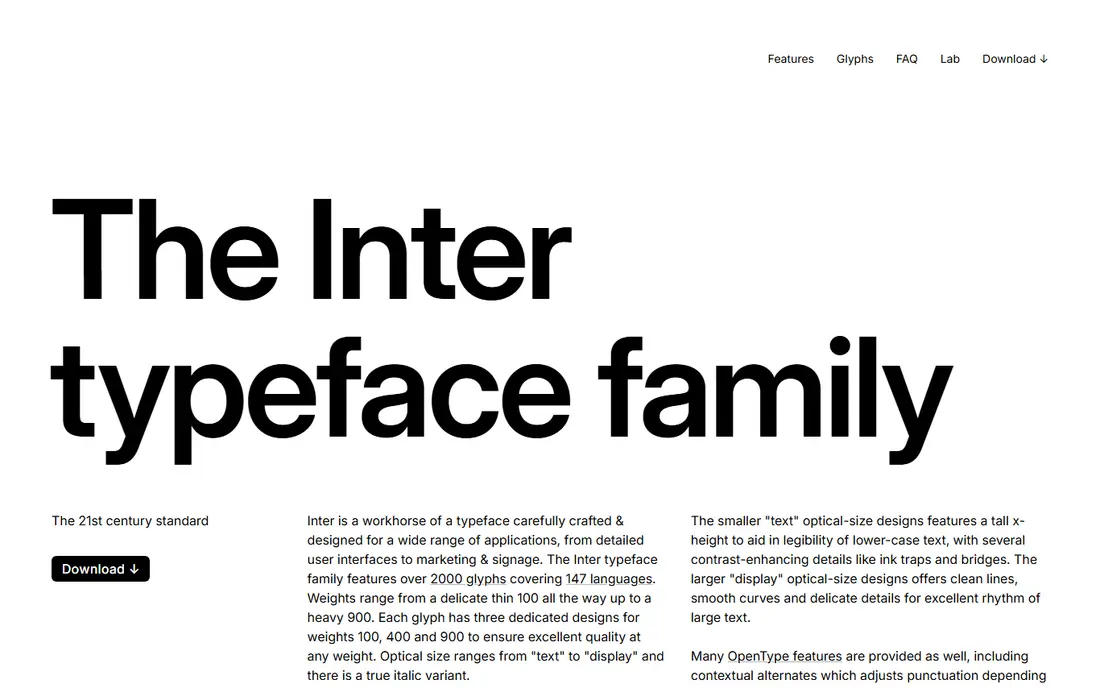
Inter is our pick for most new web and app projects. It was designed for computer screens, with a tall x-height, clear letterforms, and features for UI text such as tabular numbers. That makes labels, dashboards, and body text easier to read at small sizes, where classic Helvetica can feel tight.
It is not a clone. Inter looks more open and modern than Helvetica, and its terminals and spacing give it a distinct feel in headlines. For a project that needs a fresh, neutral interface font rather than an exact Helvetica replica, Inter is the best free choice.
- Designed for screens and small sizes
- Large x-height and clear numerals
- Variable font with many weights
- More open and geometric than classic Helvetica
- Less suited to print-first Helvetica matching
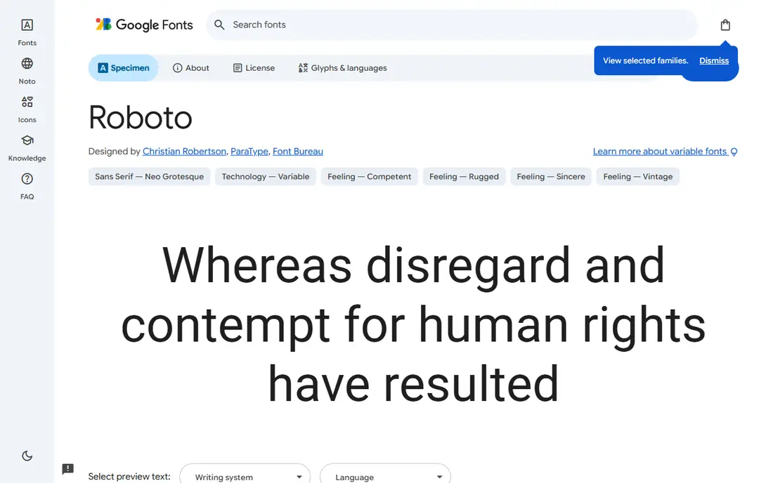
Roboto is a safe, familiar screen font. Its geometric yet friendly shapes work for apps, websites, and documents, and its wide range of weights covers headlines and body text. Because it ships with Android and Google products, many readers already associate it with clean, modern interfaces.
Compared with Helvetica, Roboto feels more open and slightly mechanical, especially in its curves and spacing. That difference is small in body text and larger in a logo or a tight headline. For a general screen font that needs to feel neutral and current, Roboto is a dependable pick.
- Clean, neutral screen font
- Wide weight range
- Familiar from Android and Google products
- More mechanical and open than Helvetica
- Condensed and rounded variants change the feel
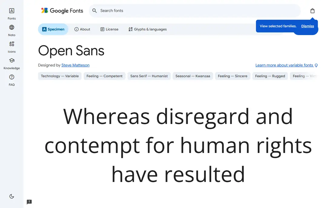
Open Sans suits blogs, help centres, and long web pages. Its open apertures and generous spacing keep paragraphs readable, and its humanist shapes feel warmer than Helvetica without losing neutrality. Broad language support also helps sites that publish in several languages.
That warmth is also its limit. Open Sans is wider and softer than Helvetica, so it takes more space in a tight layout and feels less crisp in a corporate headline. For reading-heavy content, that trade is worth it. For a strict Helvetica look, choose TeX Gyre Heros or Liberation Sans instead.
- Very readable in long text
- Warm, humanist feel
- Broad language support
- Softer and wider than Helvetica
- Less crisp for tight, corporate headlines
Liberation Sans is the practical choice when layout must not break. It is metric-compatible with Arial, which was designed to match Helvetica spacing, so documents set in Helvetica or Arial keep similar line breaks when Liberation Sans is used. That makes it useful for PDFs, office documents, and systems where Helvetica is requested but not installed.
Look closely and the details differ. Some letters, such as the lower-case r and the tail of the a, do not match Helvetica exactly, and the family has fewer weights than a modern variable font. For document compatibility, those details matter less than stable spacing. For branding, pick a font with a closer visual match.
- Metric-compatible with Arial, which matches Helvetica spacing closely
- Good for documents and PDFs
- Widely installed on Linux
- Letterforms differ from Helvetica in details
- Fewer weights and OpenType features than modern families
Arimo is a close cousin of Liberation Sans, designed as a metric-compatible alternative to Arial. That means text set in Arimo takes similar space to Arial, which helps when a design must keep its layout across systems. Its clean, neutral shapes also work for web pages, documents, and interfaces.
It is a safe rather than striking choice. Arimo can feel plain in a headline, and metric compatibility is about width, not about identical letter shapes. Use Arimo when stable spacing matters most, and use Inter or Work Sans when a more distinctive brand feel matters more.
- Metric-compatible with Arial
- Clean grotesque look
- Reliable for documents and web pages
- Plainer than Helvetica in headlines
- Spacing compatibility does not mean identical outlines
TeX Gyre Heros is the closest free match for classic Helvetica. It builds on Nimbus Sans, which itself follows Helvetica shapes, and it adds an expanded character set and refined spacing for professional typesetting. For print, PDFs, and documents that need a Helvetica feel without a licence fee, Heros is the first font to test.
It is less convenient than a Google Font. Heros is distributed through TeX and font projects, so a new user may need to download and install files rather than link a web font. It also lacks the UI-specific tuning of Inter. For a classic look in print, that effort is worth it.
- Based on Nimbus Sans, derived from Helvetica shapes
- Expanded character set
- Good for print and documents
- Less polished for modern UI work
- Distribution through TeX channels can confuse new users
Source Sans 3 is a strong all-round professional font. It was designed for user interfaces and documents, with a clear, neutral voice and a wide range of weights. That makes it useful for reports, product UI, and long-form content where Helvetica would feel too tight or too corporate.
Its roots differ from Helvetica. Source Sans draws on earlier grotesque designs, so its shapes feel slightly more humanist and open. In most body text, readers will not notice the difference. In a logo or a headline that must echo Helvetica exactly, Heros or Liberation Sans will be closer.
- Professional, neutral design
- Wide weight range
- Good for documents, UI, and long text
- More humanist than Helvetica
- Based on a different historical model, so details differ
Work Sans keeps Helvetica's straightforward structure but adds warmth. That makes it a good choice for marketing sites, editorial layouts, and brands that want clean type without a cold feel. Its screen-friendly weights also work for websites and apps where headlines need presence.
That warmth is a trade-off. Work Sans is more distinctive than Helvetica, so it will not suit a project that needs strict neutrality or an exact Helvetica match. For a brand that wants clean type with personality, Work Sans is a strong free option.
- Clean structure with a warmer feel
- Good for branding and editorial layouts
- Screen-friendly weights
- Warmer and more distinctive than Helvetica
- Less neutral for strict corporate use
Public Sans is a restrained, sturdy sans that suits reports, forms, and documentation. It was designed for public-sector use, with clear letterforms and a wide weight range that keeps dense information readable. That makes it a good choice for a business site, a report template, or a form-heavy app.
It feels softer and more institutional than Helvetica, so it will not give a sharp corporate headline the same edge. Check the latest version and licence before a large project, since the family is updated less often than larger Google Fonts. For clear, trustworthy text, Public Sans is a solid free pick.
- Neutral, sturdy design
- Good for reports, forms, and documentation
- Wide weight range
- Softer, more institutional feel than Helvetica
- Family updates are less frequent than larger Google Fonts
How we picked these
We compared official font pages, licence notes, and public design guides for free fonts that match Helvetica in neutrality, legibility, or spacing. We kept fonts that are actively available in October 2026 and that can be used for web, print, or UI work. We did not claim hands-on testing, and we treated all fonts listed here as free under their stated open licences, with licence details to check per version.
How to choose a Helvetica replacement
Start by deciding what you need to match. If layout must stay identical, pick Liberation Sans or Arimo for metric compatibility. If the look must stay close, pick TeX Gyre Heros. If the project is a new website or app, pick Inter for legibility at small sizes, and test it in real headlines and body text before committing.
Test at the sizes you will actually use. A font that looks close in a large headline can change line breaks in a paragraph, and a font that reads well in body text can feel wrong in a logo. Set the same paragraph in two candidates, check line breaks, numerals, and small labels, and ask a colleague to read it without knowing which font is which.
Frequently asked questions
Is there a free font exactly like Helvetica?
No free font is exactly Helvetica, but TeX Gyre Heros is the closest free match for classic shapes, and Liberation Sans matches Arial spacing closely. For a new screen project, Inter is often a better practical replacement than an exact clone.
Can I use these fonts for commercial work?
Most fonts listed here use open licences that allow commercial use, including the SIL Open Font License and the Apache License. Check the licence file for the exact version you download, since terms can differ by family and build.
What is the best Helvetica alternative for websites?
Inter is the best choice for most websites and apps, thanks to its screen tuning and small-size legibility. Roboto and Open Sans are also strong for screen reading, while TeX Gyre Heros suits a closer classic look.
What is the best Helvetica alternative for documents?
Liberation Sans and Arimo are best for documents where spacing must stay stable, because they are metric-compatible with Arial. TeX Gyre Heros is best when the printed look matters more than metric compatibility.
Why not just use Arial instead?
Arial is a practical substitute and is pre-installed on many systems, but it is not free to distribute in the same way as open fonts, and its details differ from Helvetica. Open fonts give you clearer licensing for web and app use.
Sources
- https://rsms.me/inter/
- https://fonts.google.com/specimen/Roboto
- https://fonts.google.com/specimen/Open+Sans
- https://fonts.google.com/specimen/Arimo
- https://www.gust.org.pl/projects/e-foundry/tex-gyre/heros
- https://github.com/liberationfonts
- https://fonts.google.com/specimen/Source+Sans+3
- https://fonts.google.com/specimen/Work+Sans
- https://fonts.google.com/specimen/Public+Sans
- https://cssauthor.com/free-helvetica-alternatives/
See where you really rank - block by block
ProMapRanker scans Google Maps across a grid of your service area. Simple monthly plans from $19, white-label on every plan.
Start freeKeep reading
 zoho books alternatives
Best Zoho Books Alternatives in 2026
Compare the best zoho books alternatives for small business accounting, from QuickBooks Online and Xero to FreshBooks, Wave, and Sage in 2026, with pricing.
Read → zluri alternatives
Best Zluri Alternatives in 2026
Compare zluri alternatives for 2026, with SaaS management platforms for app discovery, spend tracking, renewals, and automation for IT, finance and procurement.
Read → zerobounce alternatives
Best ZeroBounce Alternatives in 2026
Best zerobounce alternatives for list hygiene: compare 8 email verification tools for bulk cleaning, real-time checks and catch-all handling in 2026 today.
Read →