 ProMapRanker
Best Free Font Alternatives to Patrick Hand in 2026

Key takeaways
- Patrick Hand is a clean, printed handwriting font, so the closest free matches share its upright, legible letterforms rather than flowing script styles.
- All fonts here are free through Google Fonts under open licences, which covers personal and commercial use in most projects.
- Legibility at small sizes separates the best picks from the rest: Caveat, Kalam and Handlee read well where looser scripts turn to scribble.
- Pair any handwriting font with a plain sans serif for body text, and keep handwriting for headings, notes, quotes and labels.
Quick comparison
| Pick | Great for | Pricing starts at | Free tier | |
|---|---|---|---|---|
 Caveat | Warm everyday handwriting | Free | Yes | Visit |
 Kalam | Ballpoint pen texture | Free | Yes | Visit |
 Shadows Into Light | Light handwritten notes | Free | Yes | Visit |
 Indie Flower | Playful rounded notes | Free | Yes | Visit |
 Architects Daughter | Neat technical handwriting | Free | Yes | Visit |
 Handlee | Clean body-friendly handwriting | Free | Yes | Visit |
 Just Another Hand | Narrow condensed handwriting | Free | Yes | Visit |
 Nothing You Could Do | Fast informal handwriting | Free | Yes | Visit |
 Reenie Beanie | Tall casual handwriting | Free | Yes | Visit |
 Amatic SC | Bold condensed headlines | Free | Yes | Visit |
The best free font alternatives to patrick hand
Patrick Hand, designed by Patrick Wages, is a friendly printed handwriting font based on the designer's own handwriting. It is upright, open and easy to read, which is why it appears in comics, classrooms, blogs and product packaging. The fonts below share that printed-handwriting spirit in different weights and moods, and all are free through Google Fonts. We compared official Google Fonts pages, designer notes and specimen previews to build this list.
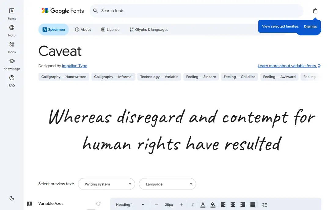
Caveat is the closest all-round swap for most Patrick Hand projects. Its letterforms feel handwritten without turning into full cursive, and its weight range lets you shift from light notes to bolder headings in the same family. A brush variant adds a marker feel for display use.
Caveat connects some letters more than Patrick Hand does, so it reads a touch more like quick handwriting and a touch less like printed letters. That difference suits quotes, captions and friendly headings. For longer reading, keep it short and pair it with a clean sans serif for the main text.
- Multiple weights including a brush variant
- Warm and natural feel
- Widely supported on web and in docs
- Slightly more connected than Patrick Hand
- Long passages tire the eye
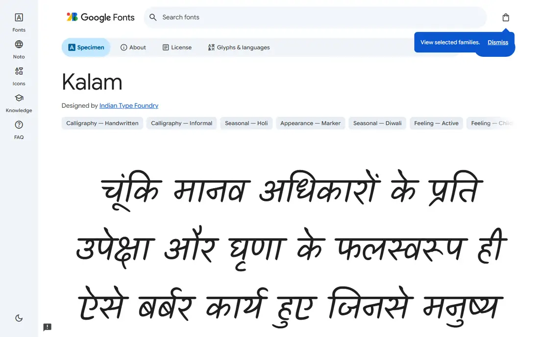
Kalam, designed by Cadson Demak, mimics informal handwriting with a ballpoint pen, and it shows. The strokes have a slightly uneven, ink-on-paper quality that feels honest rather than polished. Three weights give designers room to tune emphasis without switching families.
At very small sizes, that texture can look rough, so Kalam works best at note and heading sizes rather than footnotes. It also supports Devanagari, which matters for multilingual projects. If you want handwriting with visible pen character, Kalam is the pick.
- Three weights
- Authentic ballpoint feel
- Supports Devanagari as well as Latin scripts
- Heavier texture can look rough at tiny sizes
- Less rounded than Patrick Hand
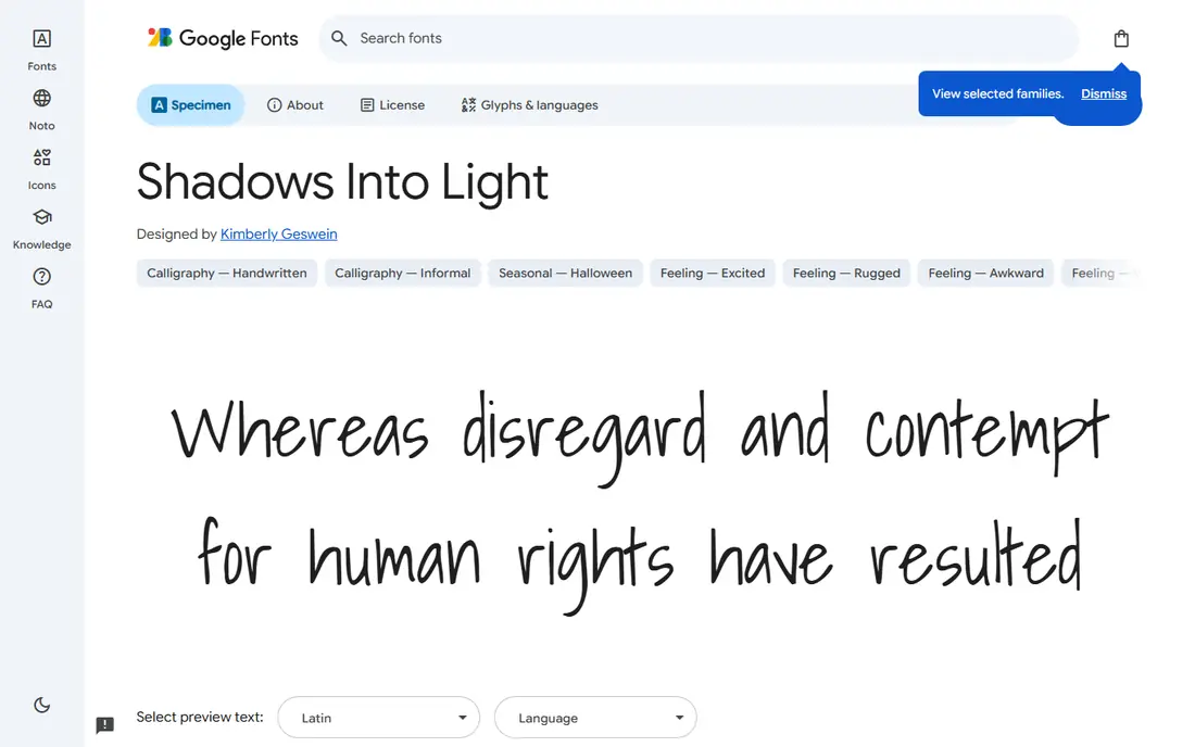
Shadows Into Light, by Kimberly Geswein, is a light, slightly narrow handwriting font that suits annotations, captions and marginal notes. Its open spacing keeps words readable even when the letters themselves are slim. It works well over photos and illustrations where a heavier font would dominate.
The single weight limits flexibility, and thin strokes can fade on screens at small sizes or in low-contrast colours. Use it generously sized and with strong contrast. For airy, friendly notes rather than bold statements, it is a lovely Patrick Hand cousin.
- Light, airy letterforms
- Good for annotations and captions
- Pairs well with clean sans serifs
- Single weight
- Thin strokes fade at small sizes
Indie Flower, also by Kimberly Geswein, leans playful: rounded, open letters with a bubbly rhythm that suits classroom materials, craft projects and children's content. It stays legible at moderate sizes, which is not true of every playful handwriting font. That readability is why it remains popular years after release.
Its tone is the limit. Indie Flower will look out of place on formal documents or premium branding. It also comes in a single weight, so emphasis must come from size and colour rather than bold variants. For friendly, informal projects, it is a safe and cheerful pick.
- Rounded, bubbly letterforms
- Very legible for a playful font
- Popular for classroom and craft projects
- Single weight
- Playful tone does not suit formal work
Architects Daughter, by Kimberly Geswein, is based on the neat handwriting of an architect's daughter, and the name fits. Letters are upright, even and precise, closer to printed lettering than to casual scribble. That precision makes it excellent for diagrams, labels, worksheets and technical notes.
It feels more formal and less warm than Patrick Hand, so it suits instructional and organisational work better than personal notes. The single weight again limits typographic range. If your project needs handwriting that reads like careful printing, this is the most precise option here.
- Precise, architectural lettering
- Excellent legibility
- Suits diagrams and labels
- Single weight
- More formal than Patrick Hand
Handlee, by Joe Prince, is one of the cleanest handwriting fonts on Google Fonts. Its letters are simple, even and easy to read, which makes it one of the few handwriting fonts that can carry short paragraphs without tiring the reader. Headings, quotes and short notes all suit it.
Handlee trades personality for clarity. It lacks the slight messiness that gives Patrick Hand its charm, so it can feel plain in a purely decorative role. For projects where readability matters more than character, such as instructions, worksheets and app interfaces, Handlee is the practical choice.
- Clean and highly legible
- Works for short paragraphs as well as headings
- Single clear style
- Single weight
- Plainer personality than Patrick Hand
Just Another Hand, by Astigmatic, is a narrow, slightly condensed handwriting font that fits more words into tight spaces. Labels, captions, comic-style annotations and sidebar notes benefit from its slim profile. The rhythm feels casually handwritten without drifting into script.
Narrow letters are harder to read at small sizes, so keep it at comfortable sizes and avoid long passages. It also comes in a single weight. For tight layouts where Patrick Hand would feel too wide, Just Another Hand earns its place.
- Narrow fit for tight spaces
- Casual handwritten rhythm
- Good for labels and captions
- Single weight
- Narrow forms reduce legibility at small sizes
Nothing You Could Do, by Kimberly Geswein, captures the look of handwriting written quickly: loose, slanted and full of movement. It suits personal quotes, journal-style layouts and informal notes where a polished font would feel wrong. Its personality is stronger than most fonts here.
That looseness costs legibility in longer passages, so use it for short bursts. It also has a single weight. When a project needs handwriting that feels genuinely quick and personal, rather than carefully printed, this is the most expressive free option.
- Fast, loose handwritten feel
- Distinctive personality
- Good for quotes and personal notes
- Single weight
- Looser forms are less legible in long text
Reenie Beanie, by James Grieshaber, is a tall, casual handwriting font with a friendly, slightly quirky rhythm. It works well for headings, stickers, social graphics and informal labels, where its height gives it presence without heaviness. The informal tone suits craft and lifestyle projects.
Tall letters need generous line spacing, or lines will crowd each other in multi-line text. It also comes in a single weight and suits short text best. For a heading that needs to feel handwritten and light, Reenie Beanie is a distinctive alternative to Patrick Hand's rounder forms.
- Tall, casual letterforms
- Friendly and informal
- Good for headings and stickers
- Single weight
- Tall forms need generous line spacing
Amatic SC, by Vernon Adams, is the display outlier here: a condensed, hand-drawn font in small caps style with regular and bold weights. It makes striking headlines, posters and packaging, and its narrow forms fit long titles into tight widths. No other font here commands a headline quite like it.
Amatic SC is not a body font. Its small caps form and narrow spacing make paragraphs hard to read, and it diverges most from Patrick Hand's printed-letter feel. Use it for headlines paired with a legible handwriting font or sans serif for the rest. When a project needs a bold handwritten headline, it is the strongest free pick.
- Two weights
- Strong condensed headlines
- Very distinctive display presence
- Small caps style only
- Poor for body text
How we picked these
We compared official Google Fonts specimen pages, designer notes and licence information for free handwriting fonts that share Patrick Hand's printed, upright character. We kept only fonts that are free under open licences and actively distributed through Google Fonts in October 2026, and we favoured legibility and genuine handwriting character over decorative scripts. Elegant connected scripts were left out because they solve a different design problem.
What to check before you choose
Test each font at the size you will actually use it, not just in a large specimen preview. A font that looks charming at headline size can turn unreadable at caption size, especially thin or narrow styles. Check character coverage too: if your project needs accented letters or non-Latin scripts, confirm the font supports them before committing.
Also check licence terms for your exact use, even for free fonts. Google Fonts open licences generally cover personal and commercial use, including web embedding and print, but embedded products such as apps and ebooks can have extra conditions. Finally, pair handwriting with a plain sans serif for body text and limit handwriting to headings, notes and labels for the most readable result.
Frequently asked questions
Is Patrick Hand itself free?
Yes, Patrick Hand is free through Google Fonts under an open licence. These alternatives suit projects that want a similar feel with a different weight, mood or letter shape.
Which free font is closest to Patrick Hand?
Caveat and Handlee are the closest all-round matches for everyday use. Caveat adds warmth and weight options, while Handlee offers cleaner legibility for short paragraphs.
Can I use these fonts for commercial projects?
Fonts distributed through Google Fonts under open licences generally allow personal and commercial use, including websites, print and client work. Check the licence on each font's page for your specific use, especially for embedded products.
Which handwriting font is best for body text?
Handlee and Architects Daughter read best in short passages, but no handwriting font suits long body text. Pair a handwriting font for headings with a plain sans serif for paragraphs.
How do I add these fonts to Google Docs or Word?
In Google Docs, open the font menu, choose More fonts, search the font name and add it. For Word, download the font from Google Fonts, install it on your computer, then restart Word to find it in the font list.
Sources
- https://fonts.google.com/specimen/Caveat
- https://fonts.google.com/specimen/Kalam
- https://fonts.google.com/specimen/Shadows+Into+Light
- https://fonts.google.com/specimen/Indie+Flower
- https://fonts.google.com/specimen/Architects+Daughter
- https://fonts.google.com/specimen/Handlee
- https://fonts.google.com/specimen/Just+Another+Hand
- https://fonts.google.com/specimen/Nothing+You+Could+Do
- https://fonts.google.com/specimen/Reenie+Beanie
- https://fonts.google.com/specimen/Amatic+SC
See where you really rank - block by block
ProMapRanker scans Google Maps across a grid of your service area. Simple monthly plans from $19, white-label on every plan.
Start freeKeep reading
 zoho books alternatives
Best Zoho Books Alternatives in 2026
Compare the best zoho books alternatives for small business accounting, from QuickBooks Online and Xero to FreshBooks, Wave, and Sage in 2026, with pricing.
Read → zluri alternatives
Best Zluri Alternatives in 2026
Compare zluri alternatives for 2026, with SaaS management platforms for app discovery, spend tracking, renewals, and automation for IT, finance and procurement.
Read → zerobounce alternatives
Best ZeroBounce Alternatives in 2026
Best zerobounce alternatives for list hygiene: compare 8 email verification tools for bulk cleaning, real-time checks and catch-all handling in 2026 today.
Read →