 ProMapRanker
Best Alternatives to Responsive Web Design in 2026

Key takeaways
- Responsive design is not the only route. Adaptive layouts, separate mobile sites, native apps and progressive web apps each solve a different problem.
- If most visitors arrive on phones, a dedicated mobile experience or an app can beat a single layout stretched across screen sizes.
- Device detection tools such as WURFL and 51Degrees let a server send a layout matched to the actual device, rather than guessing from screen width alone.
- AMP still suits publishers who need very fast article pages, but it adds a second template to maintain.
- Our pick for most small sites is Duda for a separate mobile view, with Glide or Adalo when the goal is an app rather than a website.
Quick comparison
| Pick | Great for | Pricing starts at | Free tier | |
|---|---|---|---|---|
 Duda | Separate mobile site editing | See website | Free trial | Visit |
 FlutterFlow | True native apps with code export | See website | Yes | Visit |
 Adalo | Simple native apps from one builder | $36 per month | Yes | Visit |
 Glide | Progressive web apps from data | $25 per month | Yes | Visit |
 Appy Pie | Template based native apps | See website | Free trial | Visit |
 GoodBarber | Design led native apps and PWAs | See website | Free trial | Visit |
 WURFL | Server side adaptive detection | See website | No | Visit |
 51Degrees | Device detection for adaptive sites | See website | Yes | Visit |
 AMP | Very fast publisher pages | Free | Yes | Visit |
The best alternatives to responsive web design
Responsive design stretches one layout across phones, tablets and desktops. The nine options below take a different path, and each one fits a different kind of site or team.

Duda is the closest direct swap for a team that likes websites but dislikes one layout doing every job. Its editor lets you adjust the mobile version without forcing the same changes onto desktop, which matters when phone visitors need shorter copy, larger tap targets and a call button at the top. That control is the main reason it leads this list for small business sites.
The catch is that two views mean two things to check before publishing. A change to desktop content does not always carry the intent you want on mobile, so a quick phone check after each edit is part of the routine. For agencies, the client management and white label options help, but a solo owner may find the full platform more than a simple site needs.
- Mobile view can be edited apart from desktop
- Agency and client tools are built in
- Templates are made for local business sites
- Pricing is not shown as a single simple plan on every page
- Design freedom is narrower than a full code build
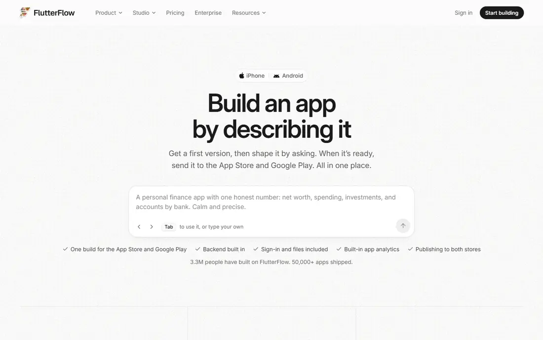
FlutterFlow suits a team that has outgrown a mobile website and wants an app in the stores. The visual builder covers screens, navigation and data, while code export gives a route out if the project later moves to a developer team. That combination is rare among no code tools, and it makes FlutterFlow a serious choice rather than a prototype toy.
The honest cost is complexity. Store submission, permissions, push setup and backend rules take time, and the free plan is best for learning the builder before committing. If you only need a mobile friendly website, FlutterFlow is overkill. If you need offline use, device features and a store listing, it is one of the strongest options here.
- Builds native iOS and Android apps from a visual builder
- Flutter code can be exported
- Firebase and Supabase connections are supported
- Real apps still need store accounts and testing on devices
- Backend setup adds work beyond the visual builder

Adalo is the gentler native app route. A small team can build a booking app, a member directory or a simple ordering app without hiring developers, and the built in database means there is no separate backend to wire up at the start. For a local business, that simplicity is often worth more than advanced features.
Limits show up as an app grows. Record counts, storage and integrations are tied to the plan, so a hit app may need a higher tier or a rebuild on a more open platform. Start with Adalo when the app idea is clear and modest in scope, and check the current plan limits before promising features that need heavy data use.
- One builder covers web, iOS and Android
- Built in database keeps small apps simple
- Components speed up common screens
- Large or data heavy apps can hit plan limits
- No full source code export for a clean move elsewhere
Glide takes the progressive web app path. Instead of asking visitors to install from a store, you send them a link and they get an app like experience in the browser, with the option to add it to a home screen on many phones. That is ideal for internal tools, customer portals and simple ordering flows where distribution matters more than store presence.
The trade is depth. Glide is data first, so it shines when the app is really a friendly front end for a sheet or table, and it struggles when the brief calls for complex animations or heavy custom logic. For teams that already keep their work in spreadsheets, though, the speed from data to working app is hard to beat.
- Turns spreadsheets and business data into a working app fast
- Apps work in a browser with no store install
- Updates publish at once
- Not a true native store app
- Design control is narrower than a custom build
- Large data sets can slow the experience
Appy Pie fits owners who want a store app and want to start from a template rather than a blank canvas. Restaurant, retail, fitness and service templates give a working structure on day one, and the builder fills in the business details around it. That head start matters when the alternative is months of custom development.
Template speed has a price in originality. Two businesses in the same category can end up with apps that feel alike, and heavy custom features may not fit the template model. Treat Appy Pie as a fast route to a solid standard app, and check the current plan and publishing terms before you commit to a store launch date.
- Templates cover many business types
- No coding is needed to start
- Store publishing help is offered
- Template based apps can look similar to each other
- Code is not exported for a full move elsewhere
- Add on costs can grow
GoodBarber is the pick for teams that care most about how the app looks. Its design system gives more control over colour, type and layout than most template builders, while still avoiding code. Content apps, shops and community apps are its natural home, and the option to ship both a native app and a progressive web app from one project keeps distribution flexible.
The platform is not a general purpose development tool. If the app needs unusual workflows, complex rules or deep third party logic, a code based build may fit better. For a polished branded app with standard content, ordering or membership features, GoodBarber gives a strong balance of look and speed.
- Strong design controls for a no code builder
- Native apps and PWAs from one project
- Content and commerce features are included
- Pricing depends on the app type and add ons
- Advanced custom logic needs workarounds
WURFL is not a builder. It is the detection layer behind true adaptive design, where the server checks the visiting device and serves a version built for its screen, features and limits. That is a real alternative to responsive design, because the decision happens before the page is built, not after it loads in the browser.
This option only fits teams with developers. You still need to build the layouts, maintain the detection data and test across device groups. For a large publisher or commerce site with very different phone and desktop needs, that effort can pay off in speed and control. For a small site, a builder with a separate mobile view is a far simpler route.
- Identifies device capabilities from the request
- Lets servers send a matched layout
- Used for large scale adaptive serving
- Needs developer setup and maintenance
- Not a website builder on its own
- Licensing terms must be checked for the use case
51Degrees plays the same role as WURFL, with a different data set and pricing shape. A site can detect phones, tablets, bots and feature support, then serve or adjust content for that device group. Combined with a content system, it gives an adaptive site a factual basis for its choices instead of a guess based on width alone.
As with WURFL, the hard part is not the detection. It is building and maintaining the layouts that detection selects, and keeping the data current as new devices appear. Teams that already run a custom site and want sharper mobile control will get value here. Teams without developers should pick a builder from the top of this list instead.
- Device detection data for adaptive serving
- Free tier helps small projects start
- Works with common web platforms
- Needs developer integration
- Detection alone does not design the layout
- Data updates need attention over time
AMP, the Accelerated Mobile Pages framework, takes a strict approach. Article pages follow tight rules on scripts, styling and layout, and in return they load very fast on phones, even on slow connections. For publishers whose traffic is mostly mobile search and social links to articles, that speed can be worth a second template.
The limits are real. AMP pages cannot do everything a full page can, and maintaining two versions of each article adds editorial work. If your site is already fast, or if most pages are interactive tools rather than articles, the payoff shrinks. Use AMP as a focused tool for article traffic, not as a whole site strategy.
- Open framework for fast loading article pages
- Backed by clear documentation
- Works well for news and blog content
- Requires a separate AMP template
- Design and script options are restricted
- Gains are smaller on already fast sites
How we picked these
We compared official feature pages, pricing pages and documentation for builders, app platforms, device detection services and the AMP project, and we checked that each option offers a genuine path other than a single responsive layout. We left out responsive only builders, retired tools and products that only claim a mobile feature without a separate mobile, app or adaptive route. Prices change, so we used the vendor page figure where it was clear and wrote See website where plans were bundled or unclear.
What to decide before you pick a route
Start with the visitor, not the tool. If most traffic is phone based but the content is simple, a separate mobile view or a progressive web app may be enough. If visitors need offline access, push messages or device features, a native app earns its extra cost. If the site is large and phone and desktop use differ sharply, adaptive serving with device detection deserves a serious look.
Budget for maintenance, not just launch. Two layouts, an app plus a website, or an AMP template all add ongoing checks. Pick the route your team will actually maintain in six months, and test on real phones before you commit. A fast desktop site that is awkward on a phone will lose the visitors who matter most.
Frequently asked questions
What is the main difference between responsive and adaptive design?
Responsive design uses one layout that adjusts in the browser as the screen changes size. Adaptive design detects the device first and serves a layout made for that device group. Adaptive work can be faster and more controlled, but it needs more layouts and more testing.
Is a separate mobile site still a good idea?
It can be, for sites where phone visitors need a different journey, such as shorter content, a booking flow or a call first layout. The risk is maintaining two sites and keeping content in sync. A builder with a separate mobile view reduces that risk compared with running two fully separate sites.
Should I build a native app instead of a mobile website?
Build an app when visitors will return often, need offline use, or need device features such as push messages and camera access. Keep a mobile website when most visits are one off, discovery comes from search, and the cost of store maintenance would outweigh the benefit.
What is a progressive web app?
A progressive web app is a website built to feel like an app in a browser, with home screen install on many phones, fast loading and offline support for cached content. It avoids store approval, but it cannot match every native device feature.
Does AMP still matter in 2026?
AMP matters most for publishers with heavy mobile article traffic and slow page loads. It matters less for sites that are already fast, or for interactive tools that need scripts and features AMP restricts. Measure your own mobile speed before adopting it.
Can device detection replace responsive design completely?
Detection can drive adaptive serving, but most adaptive sites still use flexible layouts inside each device version. The two ideas often work together, with detection choosing the version and flexible rules handling the range of screens inside that version.
Sources
See where you really rank - block by block
ProMapRanker scans Google Maps across a grid of your service area. Simple monthly plans from $19, white-label on every plan.
Start freeKeep reading
 zoho books alternatives
Best Zoho Books Alternatives in 2026
Compare the best zoho books alternatives for small business accounting, from QuickBooks Online and Xero to FreshBooks, Wave, and Sage in 2026, with pricing.
Read → zluri alternatives
Best Zluri Alternatives in 2026
Compare zluri alternatives for 2026, with SaaS management platforms for app discovery, spend tracking, renewals, and automation for IT, finance and procurement.
Read → zerobounce alternatives
Best ZeroBounce Alternatives in 2026
Best zerobounce alternatives for list hygiene: compare 8 email verification tools for bulk cleaning, real-time checks and catch-all handling in 2026 today.
Read →